Patagonia’s product page is known for its sleek design and commitment to sustainability, but is it truly user-friendly?
Our recent UX audit uncovers six key opportunities to enhance user engagement and streamline the shopping experience.
From making the search box more accessible to optimising product price placement, these insights reveal how small changes can make a big impact.
Read on to discover how Patagonia can elevate its user experience and keep customers coming back.
We’ve also recorded a video that walks you through the key findings of our UX audit for Patagonia’s product page. Check it out on YouTube to get a more detailed look at our recommendations and see them in action.
Watch the UX Audit Video on YouTube
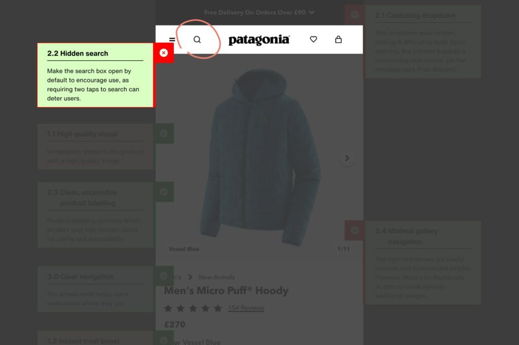
Search box is hidden - When users land on Patagonia’s product page, they might struggle to find the search box.
Extra steps required - It's tucked away and requires two taps to access, a small but significant obstacle.
Impact on user experience - This friction can deter users from quickly finding what they need.
User scenario - Imagine urgently looking for a specific Patagonia jacket. The extra effort to locate the search box might push you to look elsewhere, especially on a mobile device.
Potential consequences - Lost sales and frustrated users.
Streamline the experience. To enhance the shopping experience, make the search box readily available.
Increase visibility. By having it open by default, users can immediately start typing and find their desired products.
Reduce frustration. This small change can significantly enhance user convenience and reduce frustration.
Boost sales. Potentially increase sales by making product discovery effortless.
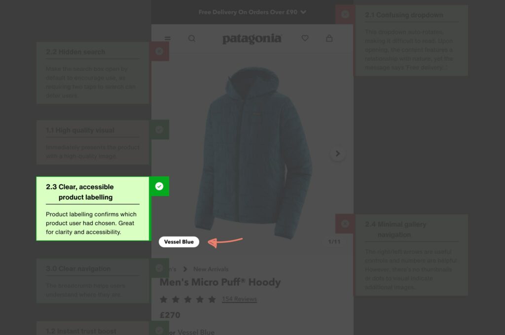
Effective labelling - Patagonia excels in product labelling, confirming which product the user has chosen.
Support user decisions - Clear labelling is great for clarity and accessibility.
Positive impact - This helps users make informed decisions quickly and confidently.
Maintain clarity. Continue to maintain this clarity in product labelling to support user decisions.
Enhance experience. Keep the labels clear and accessible to enhance the shopping experience.
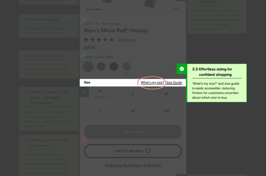
Effortless sizing - The “What’s my size?” feature and size guide are easily accessible.
Reduce friction - This reduces friction for customers uncertain about which size to buy.
Boost confidence - Helps users feel more confident in their purchase decisions.
Prominent feature. Ensure this feature remains prominent and user-friendly.
Aid in purchasing. Continue to aid customers in confident purchasing decisions.
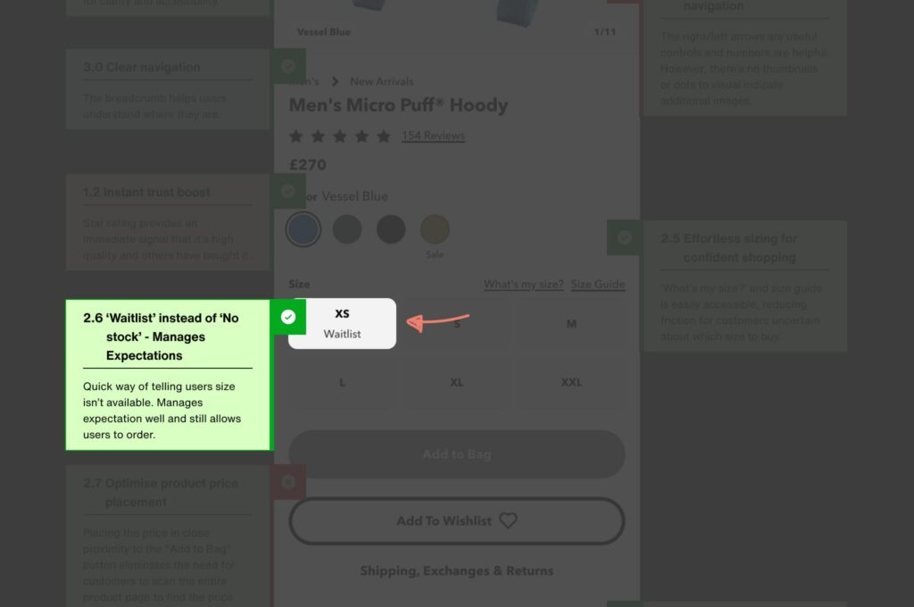
Waitlist option instead of “No stock” - Instead of displaying “No stock,” Patagonia offers a waitlist option.
Proactive approach - This proactive feature manages customer expectations and keeps them engaged even when the desired size is out of stock.
Improved customer experience - Users are informed immediately about stock issues and given an opportunity to join a waitlist, making them feel valued and reducing frustration.
User scenario - Imagine wanting a popular Patagonia item only to find it's out of stock. Instead of leaving empty-handed, the waitlist option allows you to secure your place in line, knowing you’ll be notified when it’s available again.
Potential consequences - This keeps potential customers engaged rather than losing them to competitors.
Continue utilising the waitlist. Keep offering the waitlist option to manage customer expectations effectively.
Enhance communication. Ensure that customers are promptly informed when items are back in stock, enhancing their shopping experience and maintaining their interest.
Boost engagement. This feature not only reduces frustration but also keeps potential sales opportunities open.
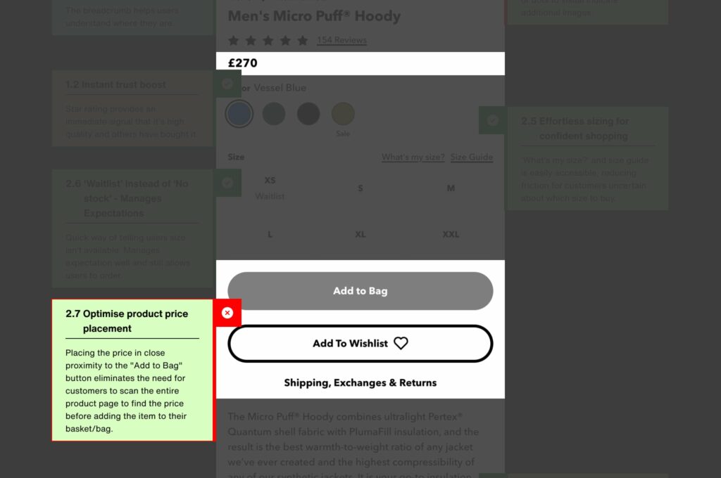
Strategic placement - Placing the product price near the “Add to Bag” button eliminates unnecessary searching.
Enhance convenience - Customers don’t have to scan the entire product page to find the price.
Improve user experience - This improves the overall shopping experience by streamlining the process.
Keep the price visible. Maintain the price placement near the “Add to Bag” button. Streamline purchasing.
Make the purchasing process as smooth and convenient as possible.
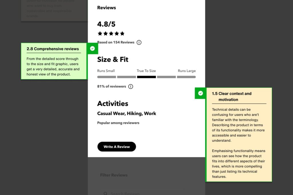
Detailed reviews - Patagonia provides detailed reviews, including a size and fit graphic.
Build trust - This offers users an accurate and honest view of the product.
Valuable insights - Comprehensive reviews help build trust and provide valuable insights.
Maintain reviews. Continue to provide comprehensive reviews to build trust.
Improve insights. Ensure reviews offer valuable insights to potential buyers.
Conducting regular UX audits can significantly enhance the user experience on your website. If you want to take control and perform your own UX audit, we've got you covered.
Want a UX audit or prefer to do your own? Download our free UX audit template/checklist to get started and discover actionable insights to boost your website's performance.

These highlights from our UX audit of Patagonia’s product page showcase the strengths and opportunities for enhancement to create an even more user-friendly experience. For an in-depth analysis, download our full UX audit report.
Visibility and ease of access to the search function are crucial.
Clear and accessible product labelling supports user decisions.
Effortless sizing features can reduce friction and boost confidence.
A waitlist option manages customer expectations effectively.
Strategic product price placement enhances the purchasing process.
Detailed reviews provide valuable insights and build user trust.
Sign up for our newsletter.
Stay up to date with latest news, updates and general on-goings.

