This article explores how you find out why nobody is buying from your website and what you can do to turn things around and increase website sales.
When figuring out why no one’s buying from your website, the first thing to look at is your website traffic numbers. If they’re low (below 500 per month), there’s a slim chance you’ll see any sales.
There’s almost always a way to convert 1% of your traffic into sales. However, if you’re not getting enough traffic, then trying to convert 1% of people coming to your website is quite a high expectation.
You’ve recently launched your website and you got 100 visitors in the first month. In the first month, 30 of those visitors were probably friends and family, 20 of the visits were probably you testing your site. That leaves 50 people to potentially buy. 1% of 50 is 0.5—so you shouldn’t expect any sales if your traffic is this low.
So if your website traffic is low, then your first challenge is to increase it. With SEO, Pay Per Click ads and Social media you can build your traffic to 500–1000 users per month, then start changing your website to drive more sales.
If you know the search terms you want to get found for, run PPC (Google or Facebook) ads to check whether visitors from those terms convert.
Example: An online shop selling organic pet food is only getting 300 visits per month. They set up PPC ads targeting “organic dry dog food” and run them for a month. They get 500 clicks and a few sales—evidence that SEO investment will be worthwhile long-term.
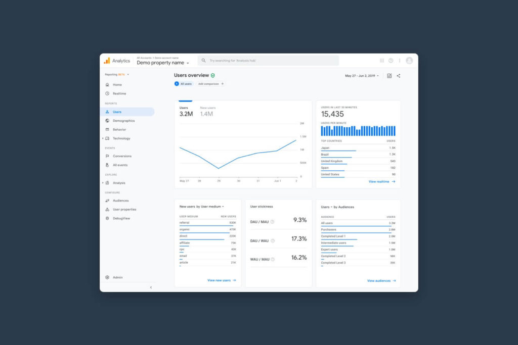
If you have enough traffic, start looking at your website data. First, check any technical issues on your site.
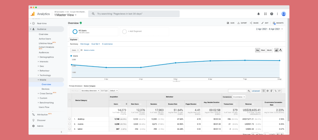
If 70% of your visitors are on mobile and can’t use the checkout on mobile, that’s a big problem.
You Use Google Analytics: Audience > Mobile > Overview to compare device performance and spot high bounce rates.
Fix big issues first and resolve bugs. Then make design and development improvements that help people buy. Bug-free sites reduce frustration and increase conversions.
If checkout is smooth and enquiries are easy, but conversions are still low, consider your messaging and UX.
First, compare what you don’t want to say vs what you do want to say.
Dear customers, take the time to find me and tell me which of my services you want. Once you’ve found my contact details I’ll hound you until you buy.
One fuzzy picture, little information, and a long checkout with hidden delivery costs. You could’ve used Amazon which you know, like and trust.
You have this pain, I want to help you fix it. Here’s how working with us benefits you. You don’t need to know everything about our services. Tell us a few details and here’s exactly what happens next.
Show multiple images from different angles with zoom. Include a video of the product in use. Add reviews for social proof. Provide technical information progressively. Make delivery costs and dates clear. Offer guest checkout and optionally create an account afterwards with a small incentive.
Value proposition: address a clear customer pain.
Benefits not features: explain how features remove pain.
Explain your process to remove uncertainty and objections.
High-quality imagery, 360/zoom, and videos.
Social proof: reviews and ratings.
Progressive disclosure: tabs/accordions for details.
Transparent delivery: costs and dates upfront; next-day options.
Guest checkout; incentivise account creation post-purchase.
Use this list as a checklist across your website. Think like your customer, design a better experience, and convert more visitors into long-term customers.
Sign up for our newsletter.
Stay up to date with latest news, updates and general on-goings.

