In the rapidly evolving world of e-commerce, creating a user experience (UX) that not only attracts but retains customers is crucial. This is especially true for websites selling subscription-based products, like Huel’s Super Greens Powder.
As the competition in the health and wellness space intensifies, brands must ensure their websites offer a seamless, engaging, and informative experience that drives conversions.
To understand the best UX approach to selling subscriptions and supplement products, we've done a UX audit of Huel’s website. We’ve uncovered key insights that will help similar businesses improve their sites and even increase sales.
Keep reading to find out more!
UX audits are essential for finding where a website’s user experience can improve. They analyse user behaviour and site performance, revealing strengths and pinpointing weaknesses that could be hindering conversions or user satisfaction.
For subscription-based products like Huel’s, a UX audit ensures the website is optimised for user engagement and smooth purchasing. This helps create a seamless journey that encourages repeat customers.
In a previous audit of Patagonia’s website, we found that:
Clear accessible product labelling
Strong sustainability messaging
Comprehensive reviews
These improvements boosted user engagement and conversions.
Similarly, our audit of Huel’s website reveals actionable insights. These findings can help other businesses in the subscription and supplement space to:
Improve their UX
Increase conversions
Drive sales
 A well-crafted product description is vital for any e-commerce platform, particularly in the supplement industry, where users rely heavily on clear and convincing information to make purchase decisions.
Huel’s Super Greens Powder product page does a commendable job in several key areas:
Engaging Visuals - The website effectively leverages product imagery that not only showcases the product itself but also highlights its benefits and end-use (a refreshing drink). This visual approach helps potential buyers quickly grasp the product’s purpose and the benefits they can expect.
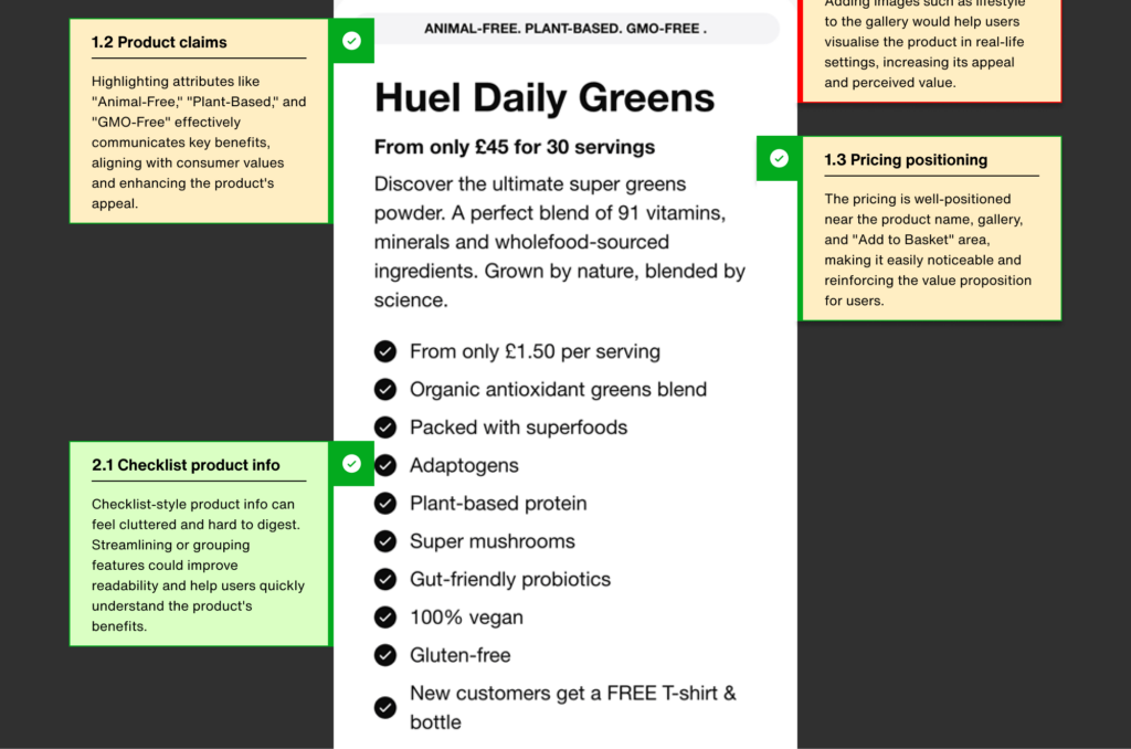
Persuasive Product Messaging - Huel effectively communicates the core attributes of its Super Greens Powder, such as being “Animal-Free,” “Plant-based,” and “GMO-FREE.” These claims are prominently displayed and resonate strongly with the target audience’s values, thereby increasing the product’s appeal.
Visibility of Pricing - The pricing strategy on the page is also worth noting. The cost is placed near the product name, image gallery, and the “Add to Basket” button, ensuring that users can easily see it without having to search. This proximity reinforces the product’s value proposition and simplifies the purchase process.
While the product presentation is strong, there’s potential to improve the user experience even further:
Incorporate Lifestyle Imagery: Adding lifestyle images—such as people enjoying the product in everyday scenarios—could significantly boost its appeal. This type of imagery helps users visualise how the product fits into their own lives, making it more relatable and desirable.
Subscription models are an effective strategy for generating recurring revenue, but their success hinges on user engagement and satisfaction.
Huel’s approach to managing its subscription-based offering reflects several best practices:
Seamless Access to Additional Information - The website incorporates quick links that provide users with access to more detailed information without cluttering the primary interface.
Building Trust with Social Proof - Huel wisely places star ratings and customer reviews prominently on the page. This immediate visibility of social proof is crucial in the supplement market, where building consumer trust is essential. Seeing positive reviews at a glance reassures potential buyers of the product’s credibility and effectiveness.
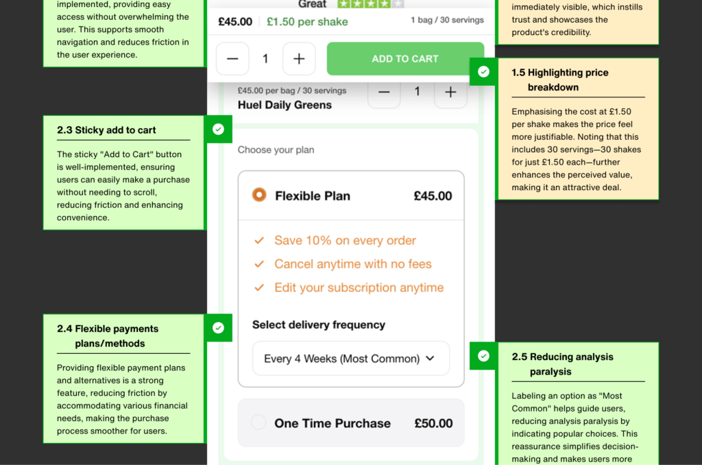
Convenience with a Sticky “Add to Cart” Button - The implementation of a sticky “Add to Cart” button on Huel’s website is a great feature . This button is always within reach, so users can proceed with their purchase at any moment, without the need to scroll.
Accessible Payment Options - Offering a range of flexible payment plans is another smart move. Huel makes the commitment to a subscription less daunting by offering various options, which is especially important for first-time buyers who may be hesitant to subscribe.
Despite these strengths, there are areas where Huel could further optimise the subscription experience:
Enhancing Sales with Upsell Options - Huel could benefit from introducing upsell suggestions, such as offering product bundles or alternative flavours during the checkout process. This way they can increase the average order value while also enhancing the user’s experience.
Minimising Disruption from External Links - The presence of external links, like the “See all benefits” link that navigates away from the product page, could inadvertently disrupt the buying process. Keeping users on the same page or ensuring these links open in new tabs would help maintain focus and prevent potential distractions during the purchase.
In the supplement market, transparency about ingredients is crucial for earning customer trust and establishing credibility. Huel’s approach to detailing the contents of their Super Greens Powder exemplifies this well:
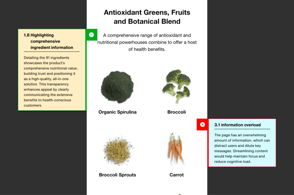
Showcasing Nutritional Transparency - Huel provides an extensive breakdown of the 91 ingredients in their Super Greens Powder, emphasising the product’s rich nutritional profile.
This level of detail serves to reassure health-conscious consumers, positioning the product as a robust, all-in-one solution that meets their dietary needs.
While transparency is essential, how the information is presented can significantly impact user experience:
Mitigating Information Overload - The extensive ingredient list, while informative, may overwhelm users if not presented carefully. Simplifying the content by highlighting the most critical benefits and incorporating collapsible sections for those interested in more detailed information could help maintain user engagement.
Streamlining Content for Better Readability - On mobile devices, long and repetitive ingredient lists can create a cluttered and cumbersome experience. Condensing this information into more digestible formats or breaking it into sections can enhance readability and make the page easier to navigate.
Regular UX audits can help recognise user experience shortcomings on your website. Take control and perform your own audit with our free template below.

Download our free UX audit template/checklist to get started and discover actionable insights to boost your website's performance.
Use lifestyle imagery in product descriptions to boost engagement.
Add upsell options in subscriptions to increase revenue.
Streamline content to avoid overwhelming users.
Keep users focused by minimising external links.
Sign up for our newsletter.
Stay up to date with latest news, updates and general on-goings.

