In this article we’ve run a UX analysis of the Buffer home page. Our UX research on the Buffer homepage is a heuristic review based on opinion and recognised usability principles which follows a set of 5 criteria:
Relevancy: does the page meet user expectation?
Clarity: Is the content / offer on this page as clear as possible?
Value: is it communicating value to the user?
Friction: what on this page is causing doubts, hesitations and uncertainties?
Distraction: what’s on the page that is not helping the user take action?
The Buffer home page has some great illustration and a simple, cohesive design. However, they could be taking advantage of their free 7 day trial and customer testimonials to remove friction and motivate even more users to signup to Buffer. In this UX review they’ve scored 2.8 out of 5.
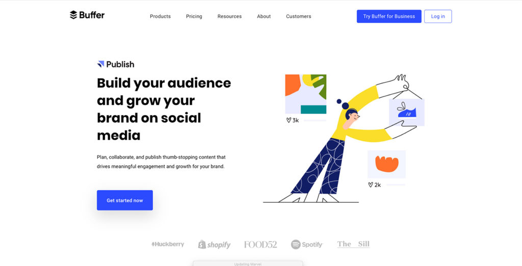 Buffer open with a strong, simple value proposition. But, is the call to action strong enough to push them through to the next step? I’m not sure that ‘Get Started’ tells you what to expect. How about… ‘Start free 7 day trial’ today (no credit card required).
The value proposition is strong, simple and straight to the point, this has been backed up with a strong subtitle “Plan, collaborate, and publish thumb-stopping content that drives meaningful engagement and growth for your brand”.
However, it’s not clear on what happens next, we have not been guided towards out next step. What happens when you press ‘Get Started Now’ will I be taken to a form to enter my bank details or is this a free trial? Users will be left feeling hesitant.
The illustrations are friendly, simple and colourful this is visually backing up the value proposition directly on the left. Friendly and kind.
 In one simple sentence we immediately understand what Buffer can provide.
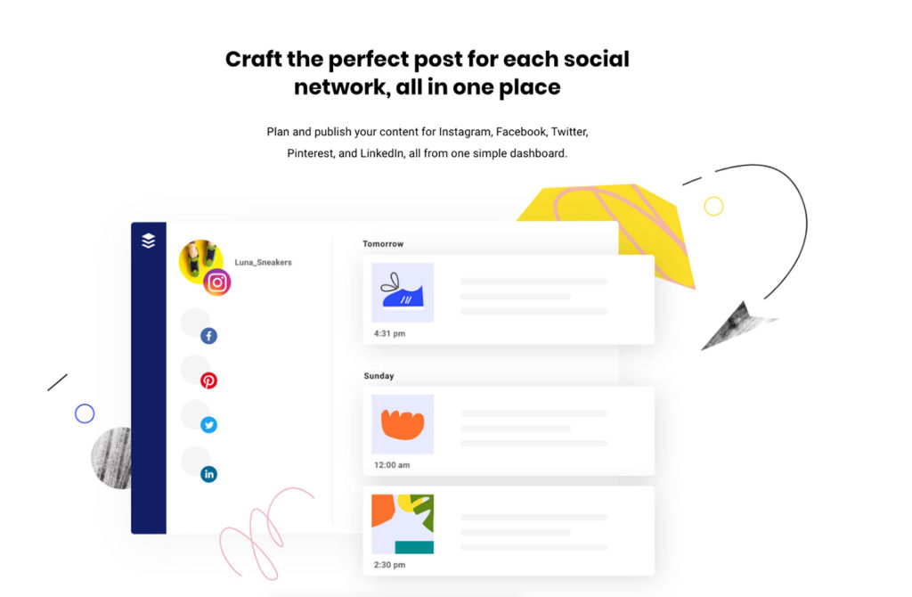
Moving beyond the fold, we start to understand what can be achieved by using buffer – “Craft the perfect post for each social network, all in one place”. At this point adding a CTA to push users to sign up would ideal. e.g. “Within 5 seconds you can schedule your first post – 7 day free trial”.
The ‘Plan and collaboration…’ section isn’t telling the whole story. It’s great that we’re told about social media planning but buffer offers so much more e.g. scheduling, publishing, etc. If users go no further than this, then they may think it’s just a planning tool, Buffer will have lost potential customers from this small missed opportunity.
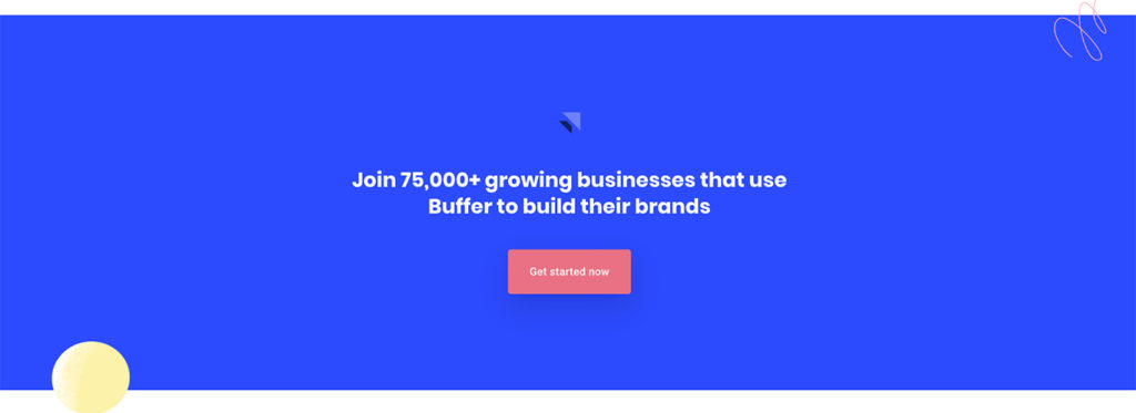
 Buffer have huge customers such as Spotify, Shopify and many more. But would a testimonial or 2 help to improve user motivation?
To gain credibility we’re presented with a range of big companies who currently use the programme – such as Shopify and Spotify. Is this enough, or do we need more info e.g. testimonials and links to case studies.
Testimonials are not present until we reach the bottom of the page, by moving these up it will ensure that the testimonials are seen by more people, as usually, most people won’t scroll to the bottom of the page.
It seems buffer chose to talk about their features over benefits. E.g. ‘Collaborate on content with your team’ could be ‘Combine everyone’s efforts and expertise to produce thumb-stopping social content’.
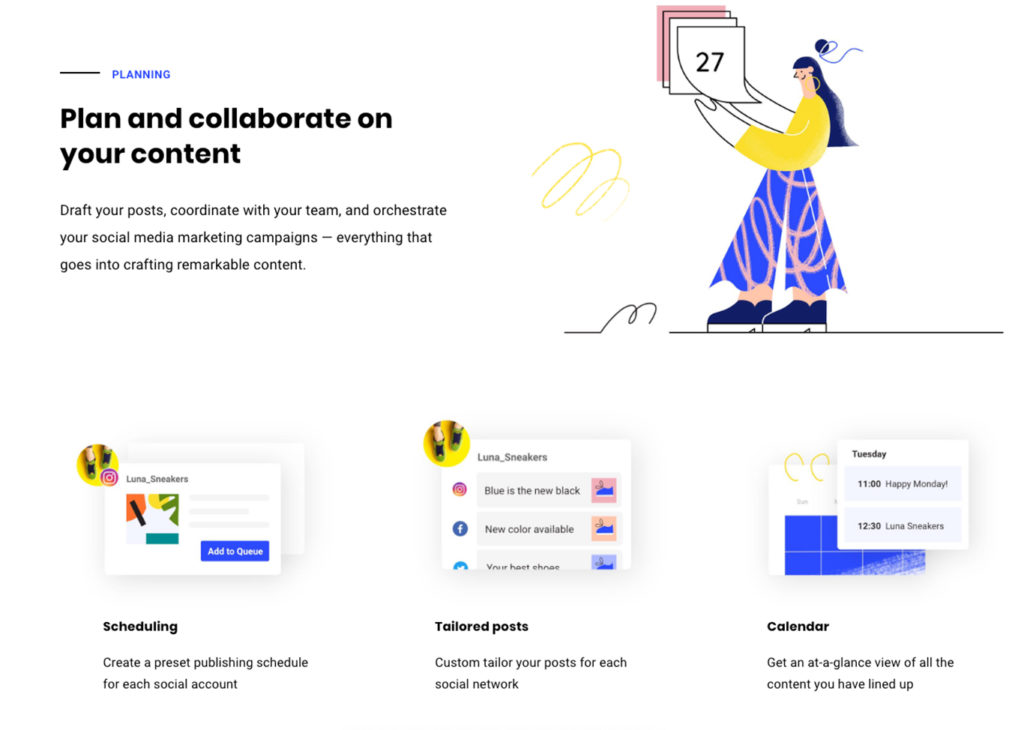 Buffer use features over benefits throughout the homepage. They need to change this so that the copy is benefit focused. Features are surface statements about your product, such as what it can do. Benefits, show the end result of what a product can actually accomplish for the user and are much more powerful.
At the bottom of the page more tabs for different social channels could be added, currently the content focuses solely on Instagram. Buffer can be used for multiple social media accounts and this is a big benefit of Buffer.
 Buffer’s biggest cause of friction is their CTA buttons ‘Get Started Now’. Users may be unsure what happens when they hit ‘Get Started’ and may not realise that they can get a free 7 day trial.
The biggest point of friction will come from the CTAs – they don’t mention the powerful words ‘Free Trial’! Why?!
The first CTA button could say ‘Start free 7 day Trial’. The secondary buttons that state ‘Get Started Now’ do not help the user understand what will happen next, Buffer is potentially missing out on 1000s of signups.
 Highlighting key features/benefits, keeping the text short and simple will avoid distraction of unwanted information.
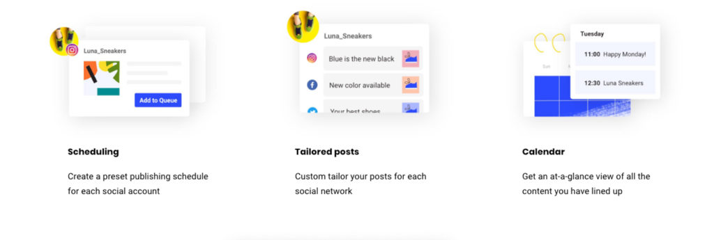
The introductory content in the ‘planning’ section feels unnecessary. Reducing this section to the 3 boxes ‘Scheduling’, ‘Tailored Posts’ and ‘Calendar’ will give users enough information without distracting them.
There’s quite a lot of repeated content throughout the website, e.g. the first ‘Plan and collaborate…’ section, then ‘Collaborate on content with your team’. Buffer could’ve talked about several more points to push more users to signup.
Merging the content together would result in users receiving a quicker and more informative summary.
Considering all that’s been analysed, discussed and reviewed, Buffer gets a total score of 2.8/5 for overall homepage user experience. Removing repeat elements and motivating users to take the next step with stronger calls to action would certainly push that score toward 5 out of 5.

Sign up for our newsletter.
Stay up to date with latest news, updates and general on-goings.

