Being an ecommerce web design agency in the ever-evolving landscape of web design, where excellent usability and user experience reign supreme. We are always on the hunt to find the perfect balance between captivating aesthetics and seamless functionality is essential.
It is the key to surpassing expectations, making a memorable impact, and fostering lasting connections with your users.
We explore and research ecommerce UX best practices extensively, and discuss how you can ensure your website offers the best experience for your users.
By understanding user needs, creating intuitive designs, optimising for different devices, simplifying interfaces, ensuring accessibility, and continuously refining through testing, you can create exceptional user experiences that meet and exceed user expectations.
UX (user experience) is the overall experience and satisfaction a user has when engaging with a product, whether it is digital or physical.
It explores a range of aspects from usability and accessibility to aesthetics and emotional engagement.
Great ecommerce UX enhances your visitors’ satisfaction when they use your website; you can build more memorable and meaningful connections between your users and your website by prioritising user experience.
In turn, this will positively impact conversion rates, user loyalty, and brand perception, driving the success of your business.
When it comes to building a great experience for your users, you want to make sure that they’re satisfied, engaged and emotionally connected.
Start with the key principles; make the user your number one priority, use clear communication, be consistent, and focus on usability.
You’ll end up with a website that leaves a lasting impression that your users will come back to again and again.
When it comes to ecommerce website design, aesthetics, and visual appeal play a vital role in shaping a user’s perception of the quality, trustworthiness, and professionalism of your brand and the products you offer.
Aesthetically pleasing designs have the power to convey credibility and reliability, whilst outdated websites can give the impression that your brand is irrelevant and you’re not focused on your online presence creating a sense of distrust.
Now that UX is becoming more of a standard aspect when building a website, it’s important to balance the functional usability with the visual aesthetics to create a sense of user delight.
This occurs when you go above and beyond the user’s expectations, creating a positive emotional response, by offering, for example, a comparison feature, or the ability to virtually try on apparel products.
By paying close attention to the fine details, you can leave your users with a positive, lasting impression.
Keep reading to find out about a couple of our favourite ecommerce websites, and how they balance excellent UX and usability with stunning visuals and aesthetics.
Apple is widely known for its focus and excellence when it comes to all aspects of design, and its website is no exception.
Balance visual appeal with usability
You can easily recognise an Apple design with its bold, sleek features, making great use of clean typography, stunning photography, and minimalist design.
Apple’s website not only makes it easy to explore the wide selection of products and services they offer, but enjoyable too.
Apple’s founder, Steve Jobs cared passionately about user experience, famously saying that ‘design is not just what it looks like and feels like’ but ‘how it works’, and reminding designers that they should put the customer first and ‘work back toward the technology’.
Clear and intuitive navigation
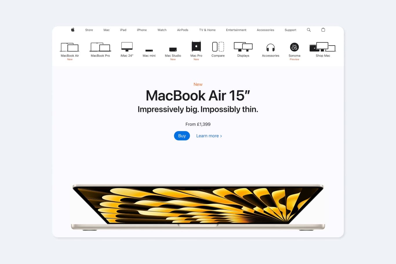
With a range spanning from physical products such as digital device accessories to services including entertainment and technical support, Apple has a lot to offer. The ecommerce web design agency working on this project has created a navigation design that works hard to effortlessly direct users to the relevant department.
Microcopy helps users to understand whether they’re clicking on a link to shop or explore a product, whilst a visual, secondary navigation makes use of simple illustrations to help users find the specific product range they’re looking for.
Consistency Across Design Elements
Consistency is key when it comes to great UX design.
Users can learn how to use the site much faster when there are consistent patterns in design elements.
You’ll instill more confidence in your users as they’ll be familiar with how interactive elements will behave.
This results in a more efficient experience, removing the distraction of inconsistency and allowing users to focus on their goals.
Responsive Layouts
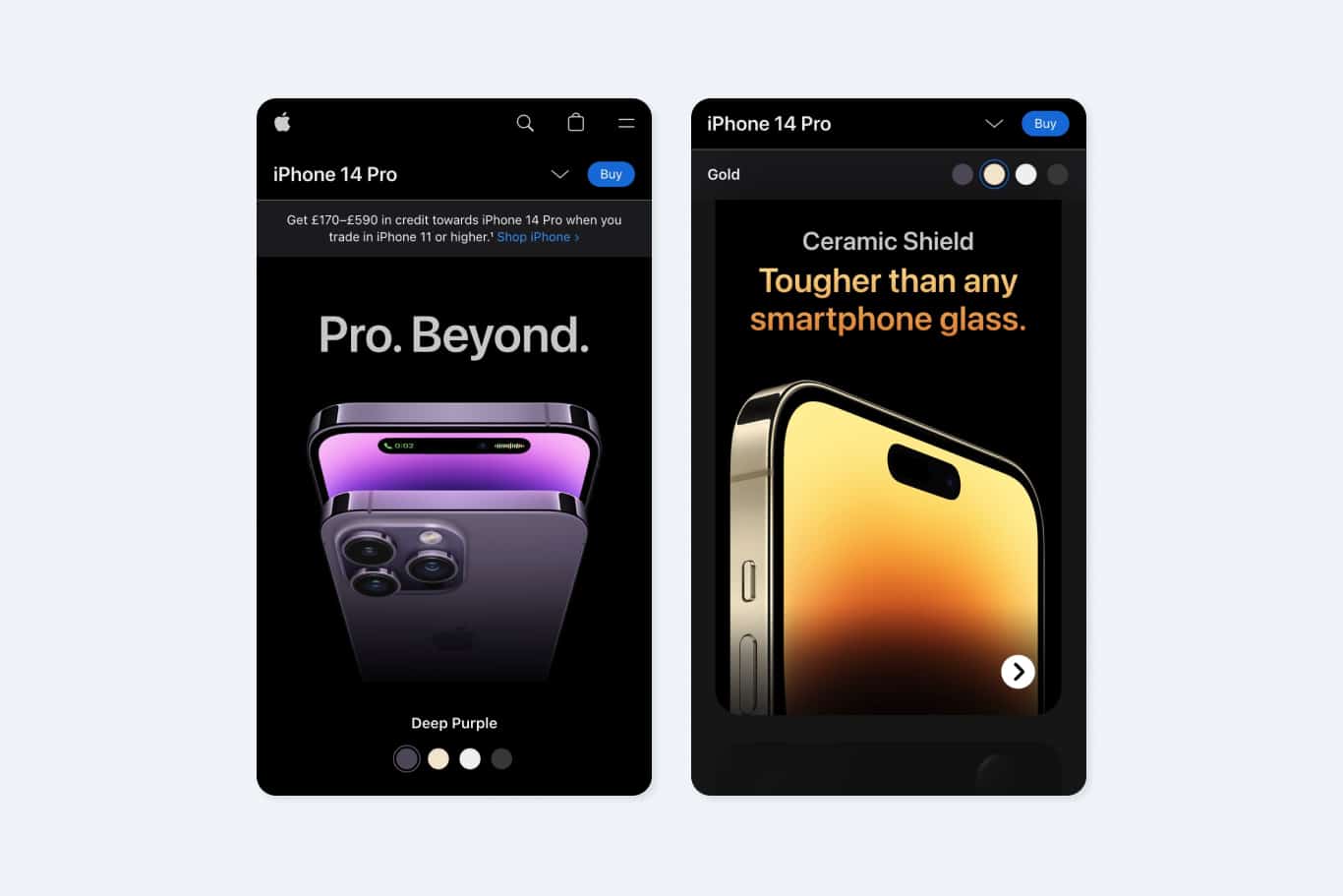
With over half of website traffic coming from mobile devices, it’s crucial for websites to be responsive between all device sizes to ensure a great user experience for all users.
Apple achieves the same level of user delight, regardless of device, effortlessly translating visual elements across all screen sizes.
Visual Appeal and Hierarchy
Apple’s website exudes modernity and refinement with an uncluttered layout, clean typography, and pristine photography.
The visual hierarchy effortlessly guides users’ attention through large, striking product images that showcase Apple’s sleek designs.
Clear and minimalistic typography serves as a navigational roadmap, while strategic use of negative space and subtle cues enhance the hierarchy for a seamless user experience.
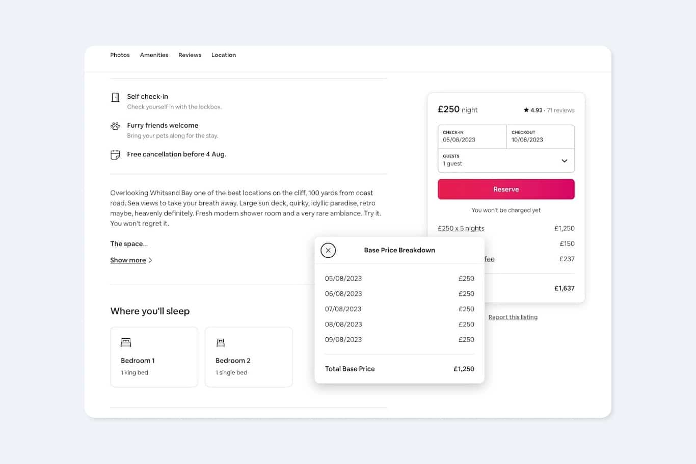
Airbnb smashes it when it comes to great UX, thanks to sleek responsiveness across all devices. The modular, flexible design effortlessly resizes across all devices whilst ensuring the website remains both accessible and visually engaging.
Clear and intuitive navigation
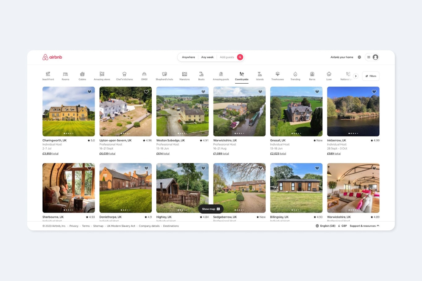
When you land on the site, they waste no time in helping you find the perfect stay. Clear navigation empowers users to state where, when, and who is going on the trip or browse by accommodation types.
Similar to Apple, Airbnb also makes use of iconography to convey information visually, helping users to understand more about the category they’re browsing.
Brand Consistency
Airbnb’s friendly, welcoming tone of voice shines through on their website, with accommodation categories like ‘OMG!’ ‘Luxe’ and ‘Amazing Views’.
Users are guided through the site through design assets including colours, typography, and imagery, reinforcing the brand identity. The overall styling on the website is kept simple and clear, allowing the properties to shine through.
The cohesive integration of these elements creates a memorable and immersive experience, developing trust and connection with users throughout their journey on the Airbnb website.
If you want to create a memorable, positive experience for your users when they visit your website, and foster a successful digital product, you need an ecommerce web design agency that can strike the balance between UX and aesthetics is crucial.
Blending captivating visuals with seamless functionality, will let your ecommerce website exceed expectations, forge lasting connections, and leave a memorable impact.
Embracing UX best practices, understanding user needs, creating intuitive designs, optimising for all device sizes, simplifying interfaces, ensuring accessibility, and refining through testing are essential steps toward providing exceptional user experiences.
By borrowing ideas from standout websites like Apple and Airbnb, you can strike the perfect balance between UX and aesthetics, leaving a lasting impression on users and driving the success of their businesses.
Sign up for our newsletter.
Stay up to date with latest news, updates and general on-goings.

