In today's digital-first world, the success of a website or app is largely determined by the quality of the user experience (UX) it delivers.
Whether you're aiming to boost sales, increase sign-ups, or simply improve user satisfaction, conducting a UX audit is a critical step in identifying areas for improvement.
Keep reading to discover a structured, objective way to evaluate User Experience through a comprehensive audit process.
A UX audit is an in-depth analysis of the interactions a user has with your website or app, aimed at identifying improvement opportunities.
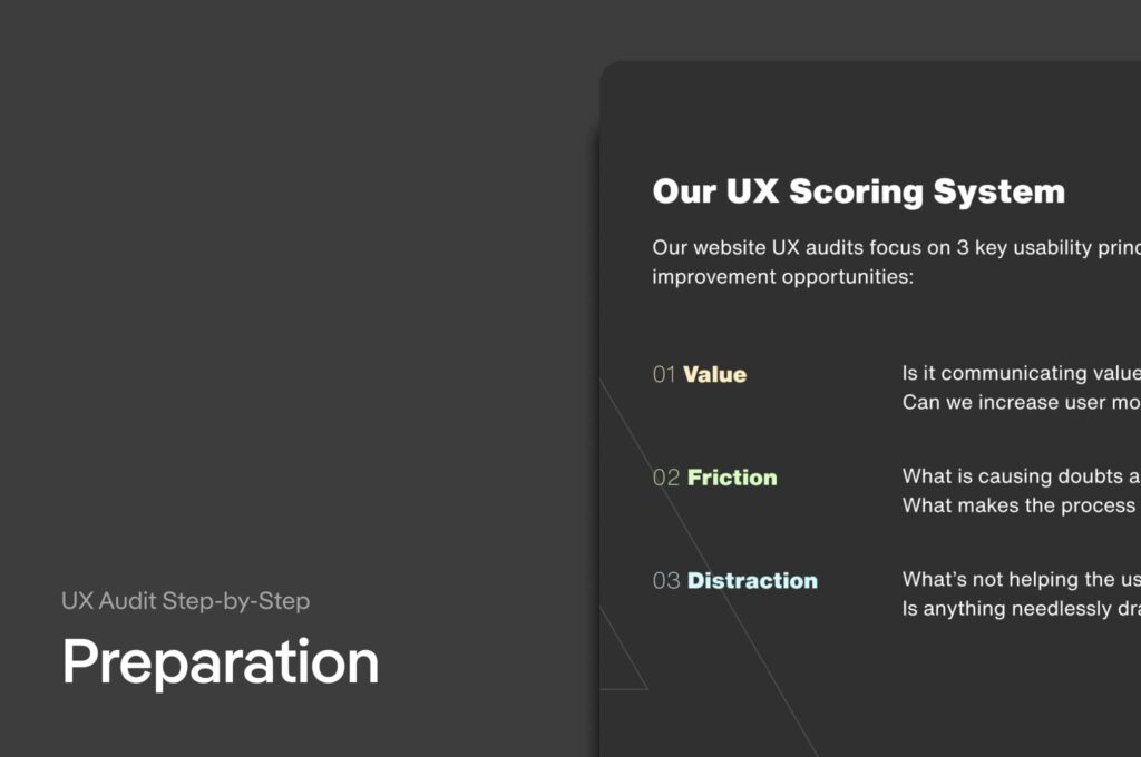
There are three key usability principles—value, friction, and distraction. Focusing on them, you’ll have a structured approach to dissect your website's UX and pinpoint high-value areas.
 The Toolkit for a savvy UX auditor
 For an effective UX Audit, you’ll need:
UX Audit Template
The UX Audit checklist
A screenshot of the website or app you’re auditing.

 UX Audit Step-by-Step
 Conducting a UX audit requires a structured approach and the right tools. Here’s how you can get started:
Firstly, understand the 3 UX principles you’ll be using to guide the audit:
Value - Does your site communicate the value of your product or service effectively to your users? It's all about motivating users to take the desired action, whether it's making a purchase, signing up for a newsletter, or booking a service.
Friction - What elements of your site may cause doubts, hesitations, or difficulties for your users? Identifying these roadblocks is crucial to smoothing out the user journey.
Distraction - Are there elements on your site that distract users from their goals? Ensuring that users are focused on the key actions you want them to take is vital for a successful UX.
Secondly, pick your tools. For our audit, we'll use Figma, a versatile design tool that's accessible to both beginners and professionals. We've developed a template that will serve as the basis for our audit.
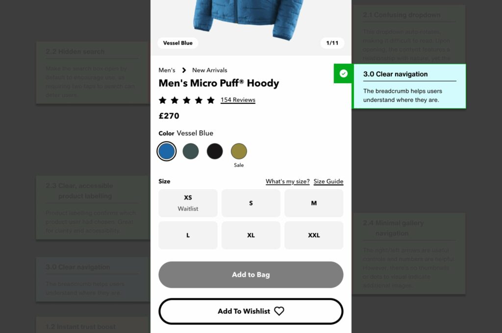
Last, but not least, decide what you want to audit - your entire website or specific components. For our demonstration, we've chosen the mobile version of the Patagonia website, focusing on a men’s micro-puff hoodie product page.
 Step 2: Execute
 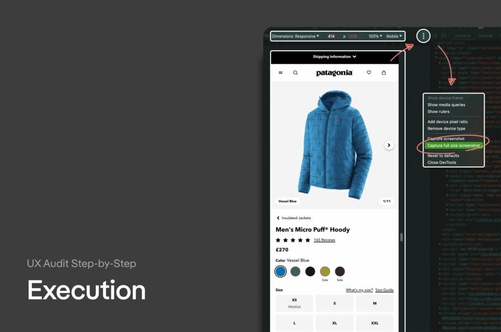 Capture full-page screenshots of your site using Chrome’s developer tools. Focus on the mobile version first, as most user interactions happen on mobile devices anyway. Once you do that you can apply usability principles.
Using our UX audit checklist, assess each page based on the principles of value, friction, and distraction.
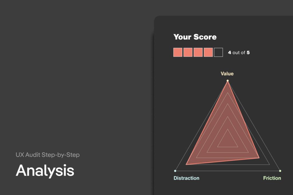 Assign scores based on adherence to the three usability principles. This helps to prioritise the areas needing attention.
The most crucial step is converting your findings into implementable changes to enhance UX. This will be in the form of a to-do list; using the observations from the UX Audit, write a to-do list (you can use a spreadsheet) which outlines what you’ll implement.
For example, if you identified that the website’s search functionality is hidden on mobile (that’s a point of friction), then you’d make an action to amend that and make sure users can always see it.
Let's walk through the Patagonia website example to provide a tangible understanding of how to complete a UX audit. This particular audit is specifically focused on one of their product pages.
First, we'll need to capture and import a full-page screenshot of your website into Figma.
With the most recent stats putting mobile search ahead of desktop search by a over 4 times as many searches, we optimise for mobile first.
Once the screenshot is imported into Figma, we're ready to start the audit process.
The first principle focuses on how well the website communicates the value of its products or services.
For Patagonia's micro-puff hoodie we examine:
product description clarity and persuasiveness
image quality
unique selling points highlighted on the page
When adding comments in Figma, we use yellow to denote observations related to value.
For example, we might note that the product imagery is high-quality and effectively showcases the hoodie's features, which reinforces its value proposition to potential buyers.
 Friction
 Next, we identify elements that might cause doubt, hesitation, or difficulty. This could include:
a complicated checkout process
unclear navigation
slow page load times
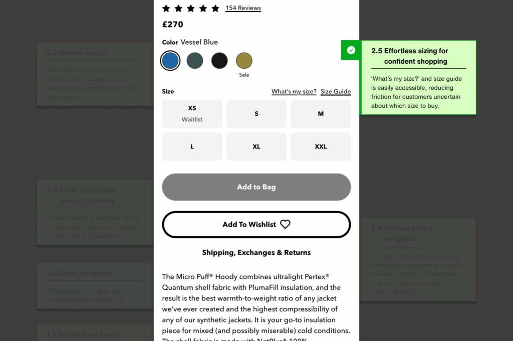
...or any other annoying error we notice. In our Patagonia example, we highlighted a potential friction point in the search functionality:
Adding comments in green, we noted that the search icon requires users to click twice before they can type their query—a process that could be streamlined for better usability.
 Distraction
 With the last principle, we assess the website for unnecessary distractions that might detract from the user's goal. This includes excessive pop-ups, irrelevant content, or competing calls-to-action.
For the Patagonia site, we used blue comments to indicate areas where the webmasters can improve to minimise distraction:
We tasked them with ensuring that promotional banners don't overshadow product information or lead users away from making a purchase. (a small, but influential change)
 Our UX audit checklist
 The checklist is an invaluable tool for ensuring no aspect of the website is overlooked during the audit.
It prompts you to ask specific questions related to each usability principle, guiding your review process.
As you apply the checklist to the website you’re auditing, you systematically evaluate each section of the page—heading from the product title and images to customer reviews and related products.
This structured approach helps uncover insights that you might miss otherwise.
 Converting findings into actionable feedback
 After you identify potential areas of improvement, the next step is to articulate your feedback in a simple way. That's how you get designers, developers, and stakeholders to understand the reasoning behind your UX suggestions.
This involves summarising your comments and recommendations, adding a priority order to them based on the impact they might have on the user experience, and discussing how the changes could be implemented.
For example: simplifying the search functionality could involve a redesign that makes the search bar always visible, reducing the steps users need to take to find products.
Through this practical example, you've seen how a UX audit can reveal critical insights into a website's usability.
Remember, the goal of a UX audit is not just to critique, but to create a roadmap for meaningful improvements that will make your website more engaging for your users.
Good User Experience is vital for website and app success.
Our UX audit identifies improvements via value, friction, and distraction principles.
Simple 3-step process: prep, execute, analyse.
UX research is only as valuable as the way you communicate its value.
Sign up for our newsletter.
Stay up to date with latest news, updates and general on-goings.

