Updated: 15 feb 2024
In today's digital age, ensuring your website is accessible to everyone, including people with disabilities, is not just a moral obligation—it's a crucial aspect of creating an inclusive online environment.
Enhanced usability: Accessibility practices not only cater to those with disabilities but also enhance the usability and UX (user experience) for all visitors.
Lighthouse benchmarking: Utilising the Google Lighthouse scoring system, we gain valuable insights into the accessibility features of websites, providing actionable suggestions for improvement and better website accessibility.
Learn from examples: By reviewing the top 10 examples of accessible websites,pata we learn from those at the forefront of inclusive design, showcasing how high accessibility scores and strategic design can create a more accessible internet for everyone.
The answer lies in the core of what the internet represents: a space for equal access and opportunity.
By embracing accessibility, you enable all users, regardless of their physical or cognitive abilities, to have a seamless and enjoyable experience on your site.
As we delve into our curated list of the top 10 website accessibility examples, each selected for their outstanding Lighthouse scores and innovative accessibility features, we'll explore what makes them stand out.
Google's Lighthouse accessibility tool is a handy open-source (free) tool designed to help improve the quality of web pages.
It highlights various issues on your webpage including performance and accessibility issues giving it a score out of 100 and suggesting improvements based on your score to improve the accessibility features of a website.
These examples not only adhere to the Web Content Accessibility Guidelines (WCAG) but also set the benchmark for inclusive design, offering valuable insights and inspiration for how to elevate your own website's accessibility.
Each site is scored with Lighthouse, and we've interpreted these scores to show how they reflect real-world accessibility and usability.
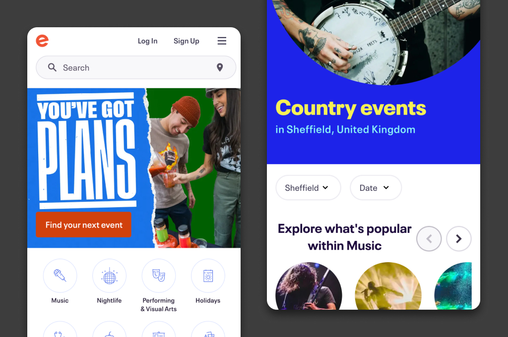
Lighthouse accessibility score - 99
eventbrite.co.uk
Score interpretation: Exceptional Accessibility.
Eventbrite's near-perfect score indicates that it has successfully implemented almost all recommended accessibility practices. Users of all abilities can navigate and interact with the site with ease, showcasing a commitment to inclusive design.
The Eventbrite website consists of clean layouts, with easy-to-process elements for both sighted users and users with low vision. Tabbing through content without the need for a mouse is also easy with a handy ‘skip to the content’ feature.
The site is fully optimised for screen readers so people with visual impairments, as well as those with cognitive and motor disabilities, can fully understand what's going on on the page.
For example, buttons have been given accessible names; instead of a screen reader simply announcing a button on a product page it will read ‘check out for £16.96’.
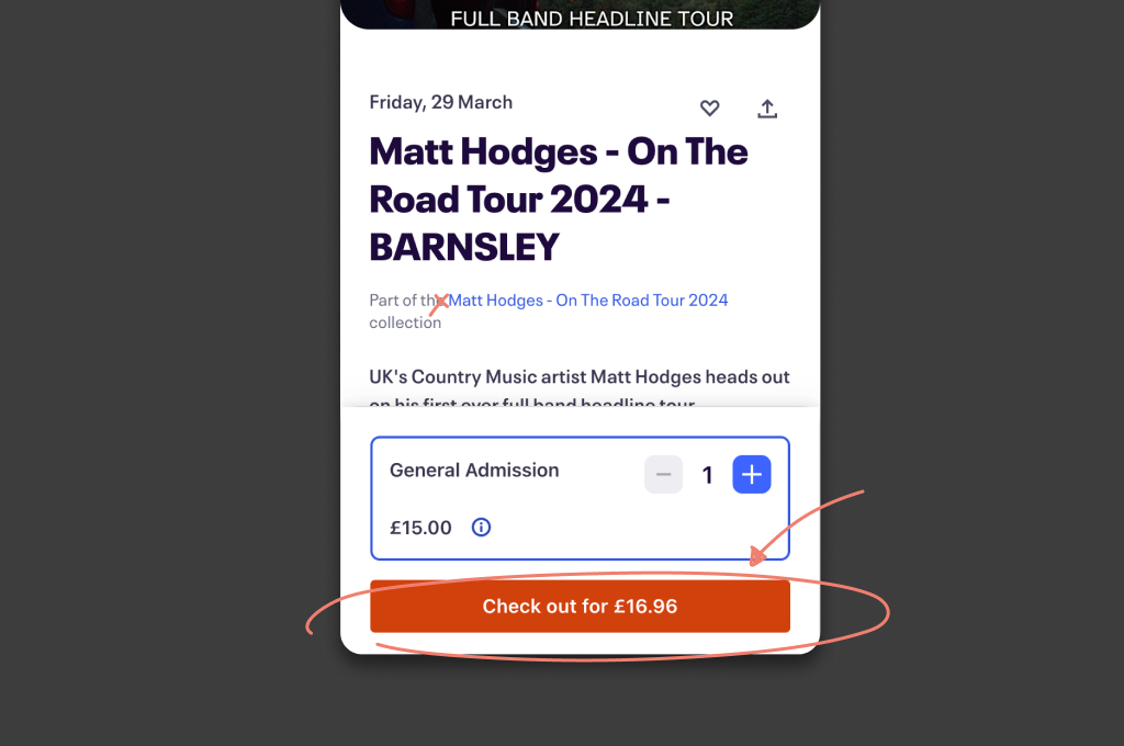
Buttons should be given accessible names e.g. ‘Check out for £16.96’.
Their lists are correctly structured with ‘li’ tags so that screen readers can inform the listener that they are listening to items with a list.
Forms are also equipped with associated labels so form controls are announced properly by assistive technologies.
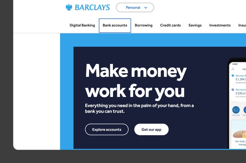
Lighthouse accessibility score - 96
barclays.co.uk
Score interpretation: Excellent Accessibility.
Barclays has achieved a high level of accessibility, making its website easily navigable for people with a wide range of disabilities. There's minor room for improvement, but overall, the site serves as a strong example of accessible banking.
The Barclays website is clean and easy to navigate with or without a mouse, providing a helpful menu of visible skip links when you tab across a landing page.
The design is clear and bold with contrasting background and foreground colours and all of the images have ALT attributes.
The site is also set up to support assistive technologies like screen readers.
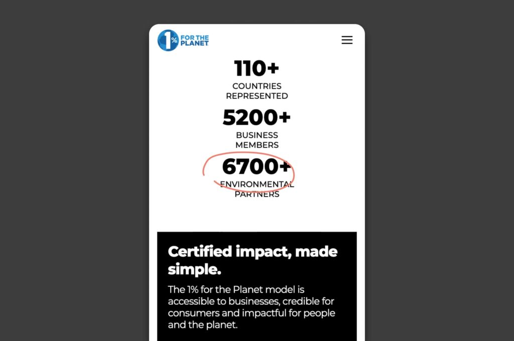
Lighthouse accessibility score - 88
onepercentfortheplanet.org
Score interpretation: Good accessibility with room for improvement.
While 1% for the Planet has made significant strides in making their site accessible, there are areas, such as video captions and keyboard navigation enhancements, that could further improve the user experience for everyone.
True to their motto “Putting people and the planet over profit,” the 1% for the Planet website is proof of their commitment to accessibility.
Page layouts are simple in structure and present content with highly contrasting text in a fully responsive design.
ARIA (“Accessible Rich Internet Applications”) tags in the HTML help to communicate the roles, states and properties of UI elements to assistive technologies like screen readers.
One thing we noticed they are missing is closed captions on their embedded video content. This would help users including those who are deaf or hard of hearing have full access to the video content.
Another thing they could work on is making their FAQ sections TAB-able.
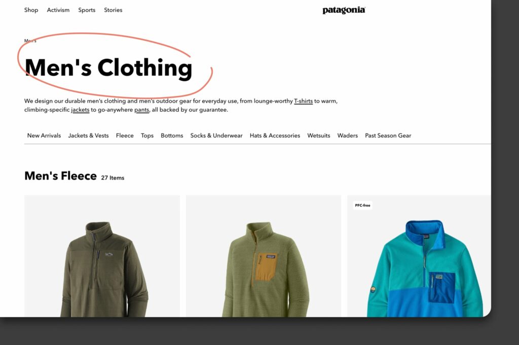
Lighthouse accessibility score - 89
eu.patagonia.com
Score interpretation: Good accessibility with minor adjustments needed.
Patagonia’s website is largely accessible, reflecting their commitment to all users, including those with disabilities. A few more tweaks could make it even more user-friendly.
The pages on the Patagonia website (eu.patagonia.com) are well-structured with clean layouts and easy-to-identify categories for both sighted users and users with low vision.
Product pages are free of distractions with large images and bold product descriptions making the page easy to take in.
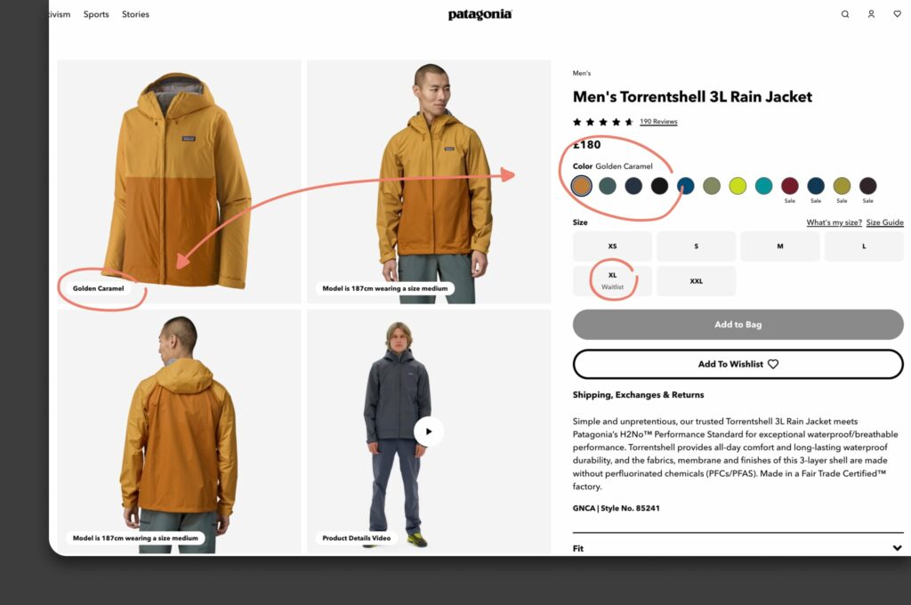
The labels in the product gallery are also particularly helpful, not only is the label helpful for screen readers, it also clarifies which product you're looking at when viewing the images - this is accessibility gold.
From a technical perspective, the code has plenty of ARIA tags, forms have associated labels, the copy is high-contrasting, and all the images have alternative text.
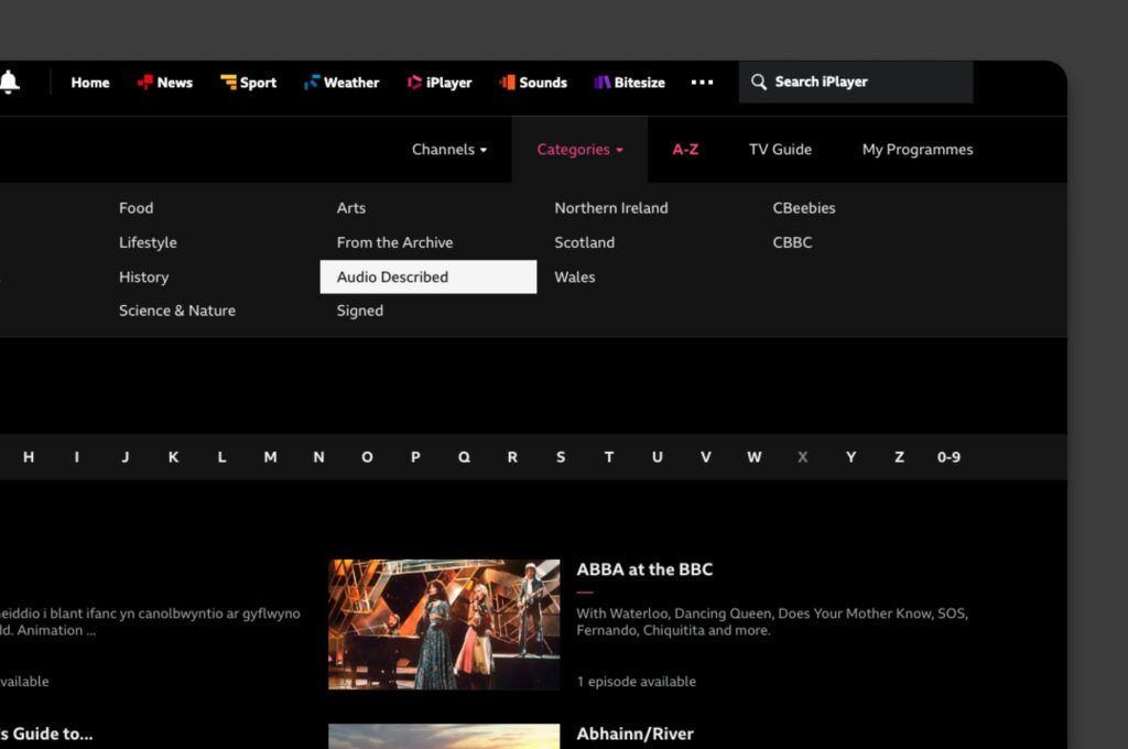
Lighthouse accessibility score - 100
Score interpretation: Ideal accessibility.
The BBC website sets the gold standard for web accessibility. With an ideal score, it exemplifies how websites can be designed to be fully inclusive, ensuring everyone has equal access to content.
The BBC website has plenty of accessibility enhancements. Their site is fully responsive and easy to navigate with a keyboard. There’s even hidden text to give screen reader users extra context.
An ‘Accessibility Help’ link that helps new users and screen readers get assistance quickly without having to scroll through the rest of the site.
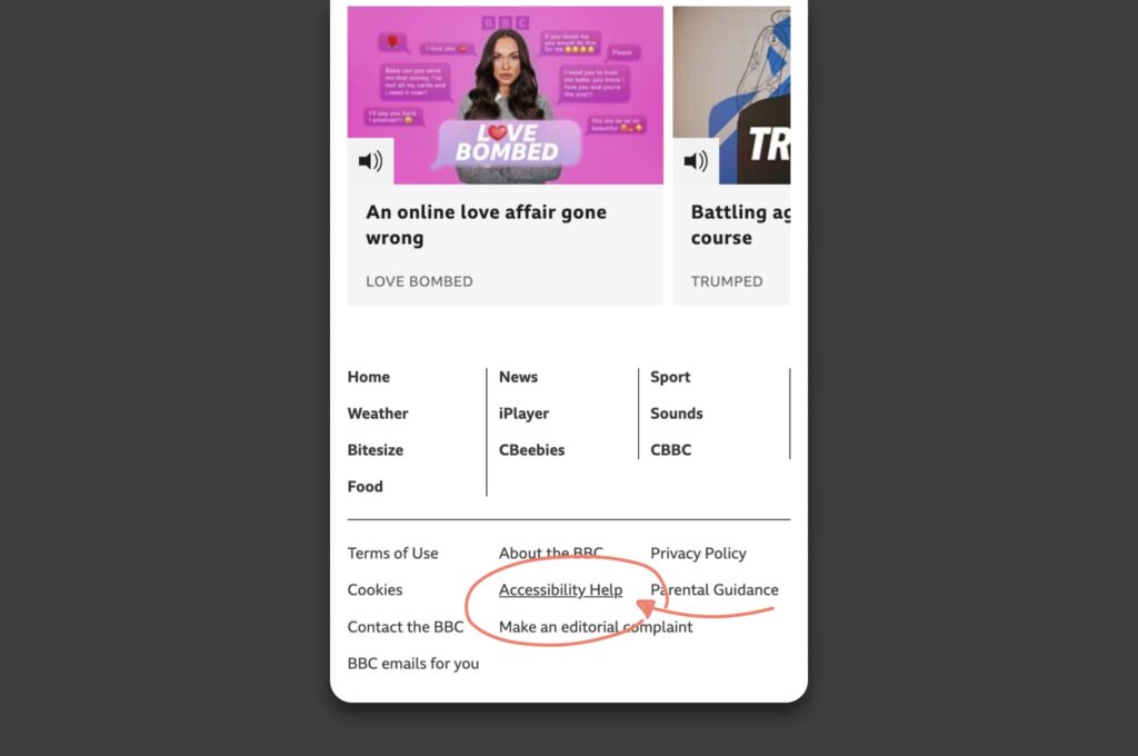
The zoom function allows users to set a zoom level that suits them and maintain the layout and proportions of the page.
All of the iPlayer programmes have subtitles available and users can find audio-described and signed programmes easily via the category navigation.
Lighthouse accessibility score - 96
wwf.org.uk
Score interpretation: Excellent accessibility.
The WWF website combines great design with accessibility, ensuring that environmental advocacy is reachable by all. A slight improvement can make it flawless in terms of accessibility.
The WWF website shares plenty of helpful information in an accessible and easy-to-navigate layout without overloading its pages with content. The copy is big and bold with plenty of contrast to make it easy to read and each page has a clean layout with minimal distractions.
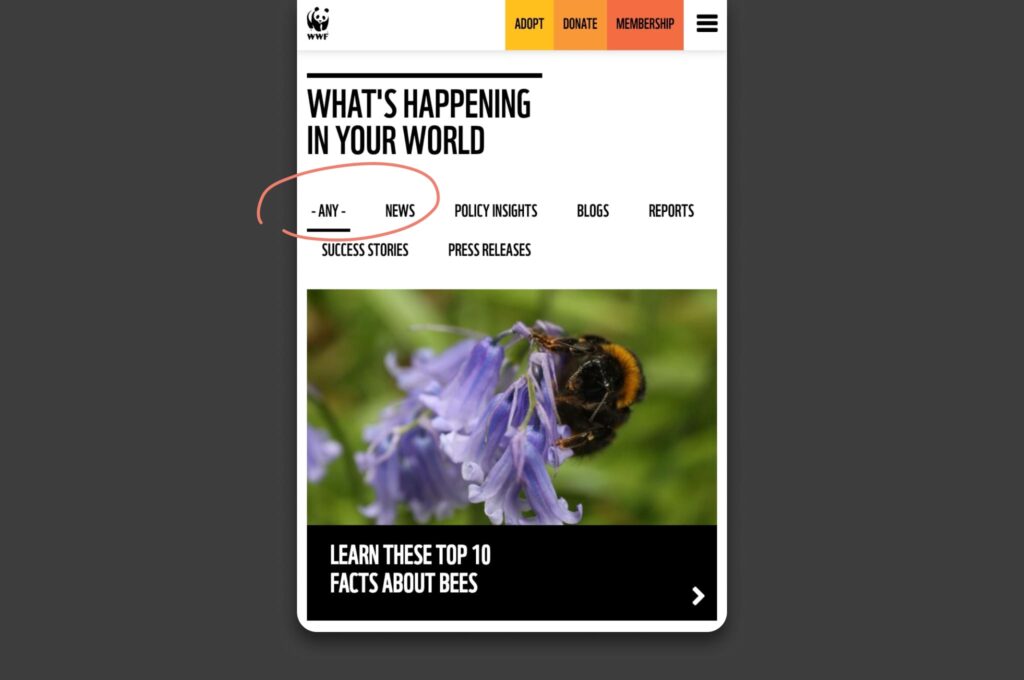
The on-page navigation is also designed to be bold and clear, making it easy to identify the page you're looking for and know exactly where your clicking on the site.
The site is also chock full of accessibility HTML tags and the relevant UI elements that work with assistive technologies like screen readers.
7. Lonely Planet: 94
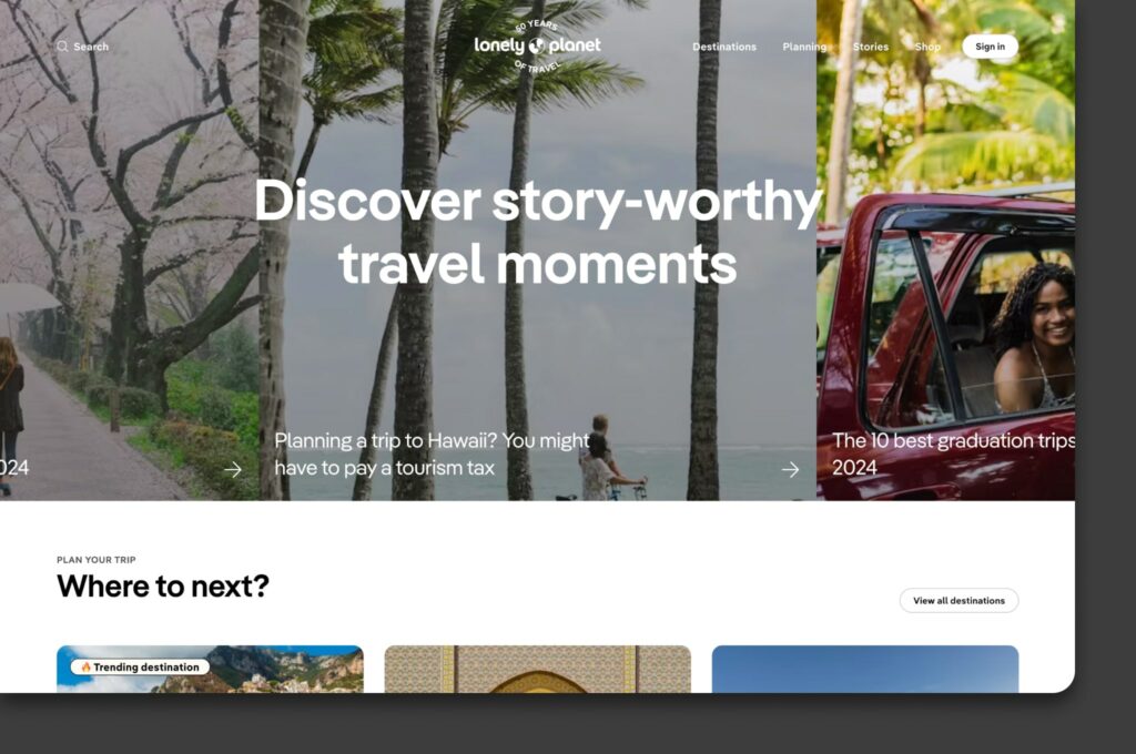
Lighthouse accessibility score - 94
Score interpretation: Very good accessibility.
Lonely Planet’s website is designed to be welcoming and accessible to travelers of all abilities. It stands out as a resource that nearly everyone can use effectively, with some areas left to polish.
Much like the WWF website, the Lonely Planet website has been designed to eliminate any distractions allowing visitors to focus on specific elements without feeling overwhelmed.
The easy-to-identify sections and clean landing page layouts help users with ADHD and neurodevelopmental disorders navigate around the site, read through the content, and get to where they want to be and achieve conversion goals.
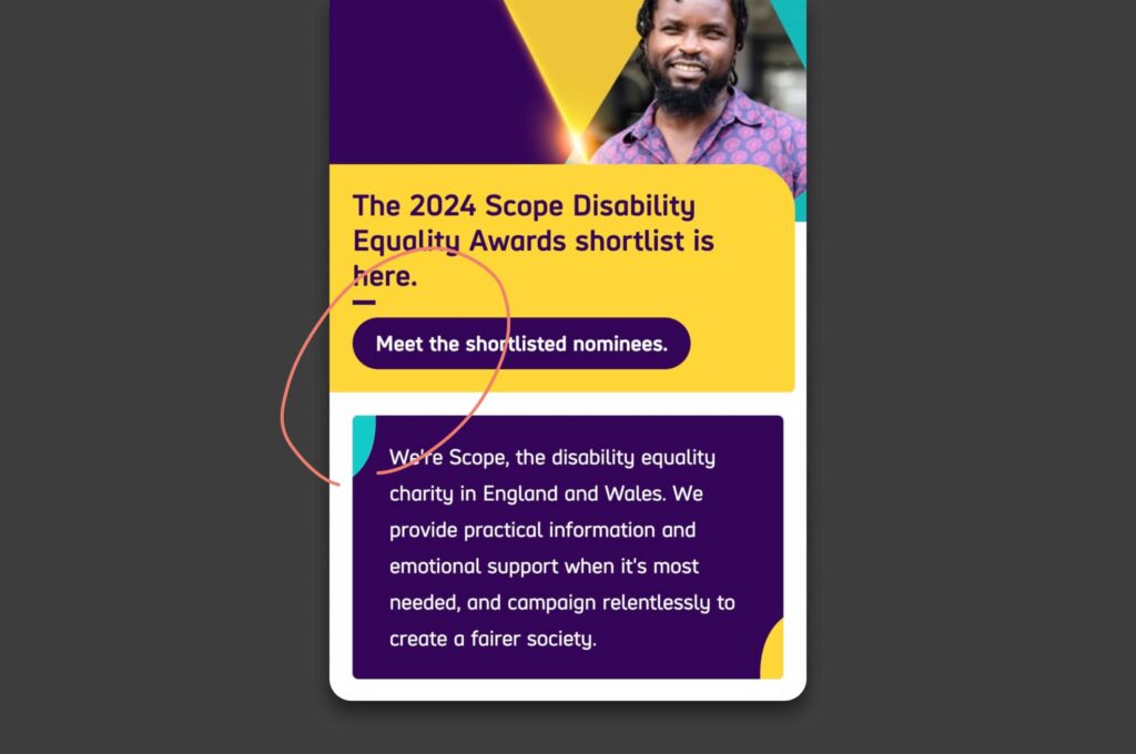
Lighthouse accessibility score - 100
Score interpretation: Ideal accessibility.
Scope's website demonstrates exceptional accessibility, ensuring that information and resources are available to everyone, reflecting their mission to enable equality for disabled people.
Scope.org.uk is an excellent example of keyboard accessibility done well. When you tab through the page there is the option to ‘Skip to the main content’ so you avoid tabbing through the whole page.
The transition styles have been designed with thick borders making it super easy to track where you're tabbing.
The site itself is designed with large, high-res images and contrasting colours, making it easy on the eye. Combined with large font sizing, line spacing and well-designed buttons, the whole website is super easy to digest and navigate around.
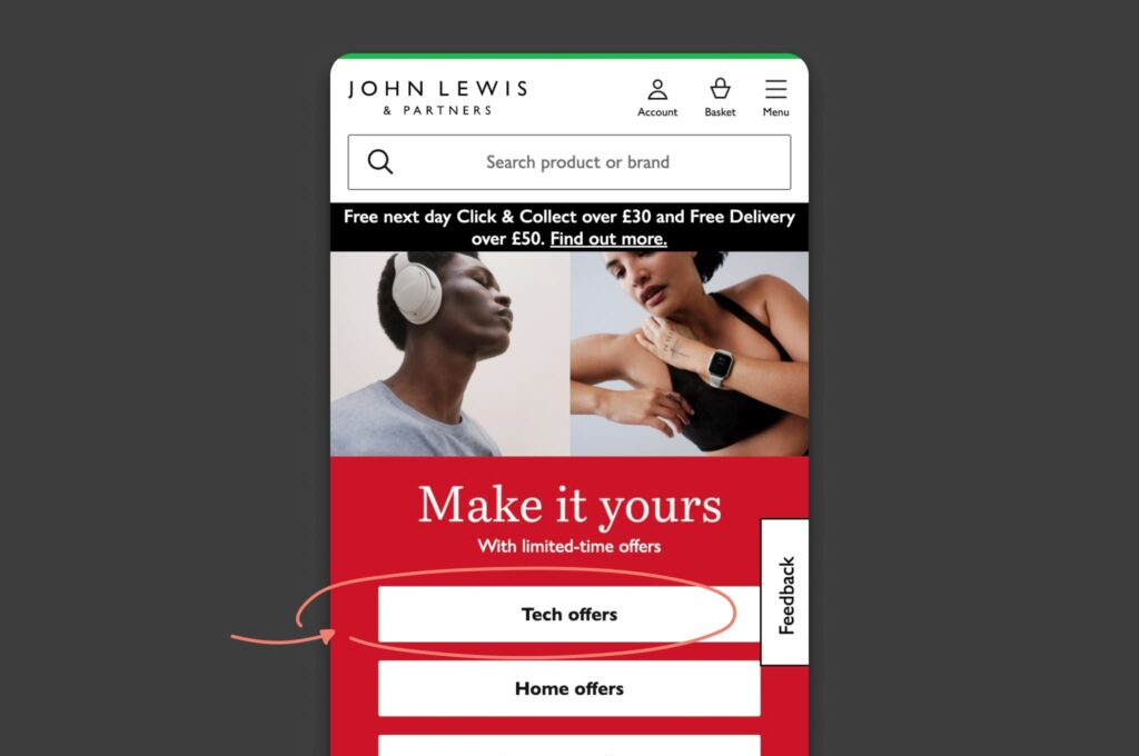
Lighthouse accessibility score - 94
Score interpretation: Very good accessibility.
John Lewis provides a shopping experience that is accessible to a wide audience, including people with disabilities. Their commitment to accessibility is evident, though there's a bit of room for enhancements.
From a technical perspective, the John Lewis Website HTML structure is nice and clean with all the necessary ALT and ARIA elements.
Form elements have associated labels and skip links are added in the header for keyboard navigation, making it easy for assistive tech.
Taking into consideration the vast amount of products on the John Lewis website, they do a good job of creating easily identifiable elements on the page, with high res images and highly contrasting colour copy.
The transition styling is also bold and high contrast to make tracking your tabs super easy.
The zoom functionality is great too so users can set their preferred zoom level and maintain the layout and proportions of the page.
Lighthouse accessibility score - 100
Score interpretation: Ideal Accessibility.
GOV.UK is an exemplary model of how government services can be made accessible to all citizens, showcasing best practices in web design and accessibility.
GOV.UK is another great example of how to make a website experience as inclusive as possible.
The site has well-structured HTML, with all the extra enhancements for screen reader and keyboard users so they can make full use of the whole site.
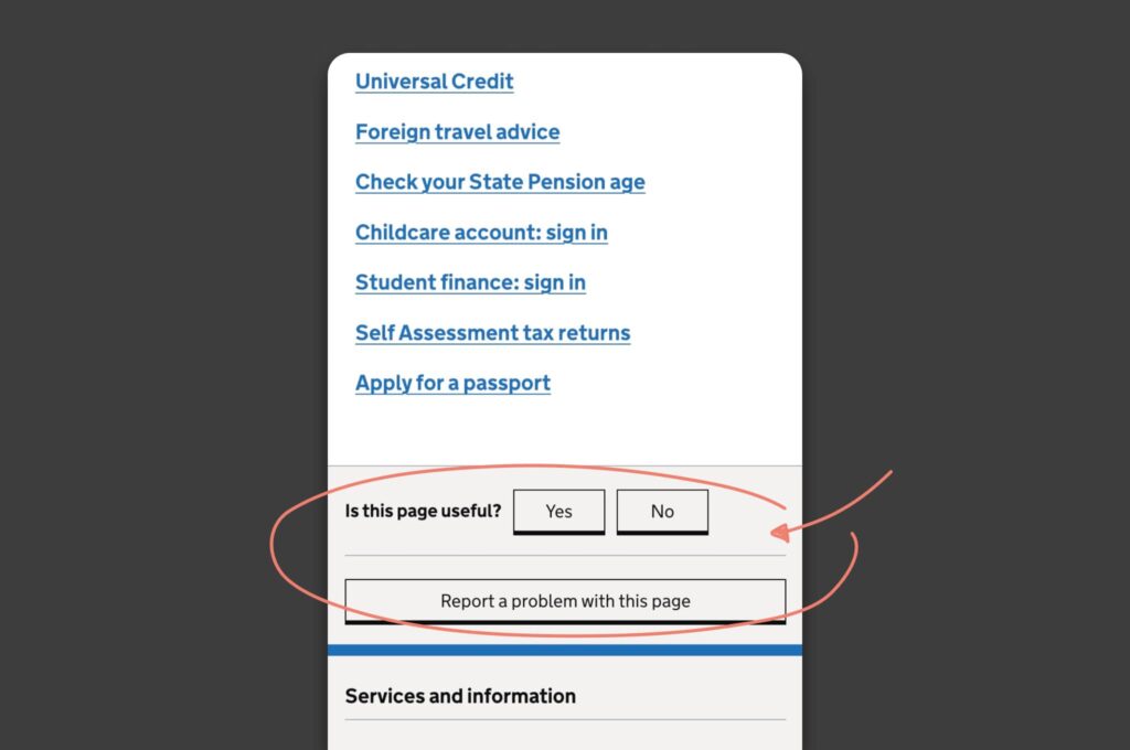
For the GOV.UK site, ARIA attributes on form elements are particularly important. There are lots of form fields on the site and these will ensure screen reader users can navigate their way to the right forms and fill them in correctly.
One thing all of these websites have in common is that they adhere to the Web Content Accessibility Guidelines (WCAG). An international standard, including WCAG 2.0, WCAG 2.1, and WCAG 2.2. WCAG documents which explain how to make web content more accessible to people with disabilities.
Their goal is to provide a single shared standard for web content accessibility that meets the needs of individuals, organisations, and governments internationally.
How to perform an accessibility audit on your website with Google Lighthouse
Running an accessibility audit on your website is essential to ensure it's usable for all visitors.
Google's Lighthouse tool, which is built into the Chrome browser, can quickly provide insights into where your site stands in terms of accessibility.
Follow these steps to conduct an audit:
Open Google Chrome
Chrome houses the Lighthouse tool, so you'll need to use this browser to perform the audit.
Navigate to your website
Enter the URL of the site you want to audit into Chrome's address bar and let the page fully load.
Access Developer Tools
You can open Chrome's Developer Tools by right-clicking on the page and selecting 'Inspect', or by pressing Ctrl+Shift+I (or Cmd+Option+I on a Mac).
Find Lighthouse
Within the Developer Tools, locate the 'Lighthouse' tab. It may be hidden under the '»' if there are many tabs.
Configure your audit
In the Lighthouse panel, you can choose which audits to perform. For an accessibility audit, make sure the 'Accessibility' box is checked.
Run the audit
Click 'Generate report' to start the audit. Lighthouse will evaluate the current page.
Review the results
After the audit finishes, Lighthouse will display a report. Scores closer to 100 indicate better accessibility.
Understand the scores
The report will detail issues that need fixing and provide suggestions for improvement.
Implement changes
Make changes to your site based on the audit. This might include adding alt text to images or improving navigation.
Re-run the audit
After adjustments, run Lighthouse again to ensure your changes have been effective.
By following these steps, you can get a good understanding of your website's accessibility and take actionable steps to improve it.
Remember, automated tools like Lighthouse are helpful, but they're not a complete solution.
Manual testing, particularly with users who have disabilities, is also crucial to ensure your website is truly accessible.
Below is the full list of accessibility audits from the Lighthouse scoring system, re-ordered to start with the highest weights (the most important audit points), followed by the rest in descending order.
Each item includes a plain English explanation:
The most important audits your site/page must adhere to:
[aria-*] attributes match their roles: Ensures ARIA attributes align with their corresponding roles for accurate screen reader interpretation.
[aria-hidden=”true”] is not present on the document <body>: The main content should not be hidden from assistive technologies.
[role]s have all required attributes: Checks that elements with specific roles also have the required ARIA attributes.
Elements with an ARIA that require children to contain a specific have all required children:
Parent elements must have child elements with the correct roles as required.
[role]s are contained by their required parent element:
Elements with specific roles are nested within the correct parent element.
[aria-*] attributes have valid values:
ARIA attributes must have acceptable values that assistive technologies can utilize.
[aria-*] attributes are valid and not misspelled:
Ensures ARIA attributes are correctly spelled and valid.
Buttons have an accessible name:
All buttons should be named so screen readers can announce what they are.
ARIA IDs are unique:
ARIA IDs must be unique to prevent confusion among elements.
Image elements have [alt] attributes: All images should have alternative text descriptions (alt tags).
Input buttons have discernible text:
Buttons should contain text that users can read or that screen readers can announce.
[input type=”image”] elements have text:
Image input types must have alternative text for accessibility.
<video> elements contain a <track> element with [kind=”captions”]:
Videos should have captions available for those who are deaf or hard of hearing.
Cells in a <table> element that use the attribute refer to table cells within the same table:
Table cells with headers should refer correctly to other cells in the same table.
<td> elements in a large <table> have one or more table headers:
Large tables should have header cells that describe the content of each column or row.
[user-scalable=”no”] is not used in the <meta name="viewport"> element and the attribute is not less than 5:
Ensures users can zoom in on the page for better readability.
[accesskey] values are unique:
Each access key (keyboard shortcut) must be unique to work correctly.
button, link, and menuitem elements have accessible names:
Interactive elements like buttons and links must have names that assistive technologies can read.
**Elements with role="dialog" or role="alertdialog" have accessible names**:
Dialogs and alert dialogs should have titles or labels that explain their purpose to assistive technology users.
[aria-hidden=”true”] elements do not contain focusable descendants:
Elements that are hidden from screen readers should not contain interactive content.
ARIA input fields have accessible names:
Fields for user input must be labeled or described for screen reader users.
ARIA meter elements have accessible names: Meter elements, like those used to display a gauge, must have text descriptions.
ARIA progressbar elements have accessible names:
Progress bars should have text labels to describe what they represent.
Elements with the role=text attribute do not have focusable descendants:
Elements designated for text display should not contain elements that can be interacted with.
ARIA toggle fields have accessible names:
Elements that function as on/off switches must have descriptive labels.
ARIA tooltip elements have accessible names:
Tooltips, which give additional information on hover or focus, need clear descriptions.
ARIA treeitem elements have accessible names:
Items in a tree structure must have labels to describe each branch or leaf node.
The page contains a heading, skip link, or landmark region:
Pages should have navigational aids like headings, skip links, or landmarks for easier navigation.
Background and foreground colors have a sufficient contrast ratio:
Text and background colors should contrast well for readability.
<dl>'s contain only properly-ordered <dt> and <dd> groups, <script>, <template> or <div> elements:
Definition lists should be structured correctly.
Definition list items are wrapped in <dl> elements:
Items in a definition list must be contained within the correct parent element.
Document has a <title> element:
The document should have a title that describes the page content.
[id] attributes on active, focusable elements are unique:
IDs on interactive elements must be unique to ensure they are properly targeted.
[role] values are valid:
Roles assigned to elements must be recognized by assistive technologies.
Elements with visible text labels have matching accessible names:
The visible text on elements should match the labels read by screen readers.
Form elements have associated labels:
Form inputs should have text labels that describe their purpose.
Links are distinguishable without relying on color:
Links should be identifiable by more than just color to assist colorblind users.
Links have a discernible name:
Hyperlinks need clear and descriptive names.
Lists contain only <li> elements and script supporting elements (<script> and <template>):
Proper list elements should be used within unordered and ordered lists.
List items (<li>) are contained within <ul>, <ol> or <menu> parent elements:
List items should be placed within the correct type of list.
<frame> or <iframe> elements have a title:
Frames should have titles that explain their content or function.
Select elements have associated label elements:
Dropdown menus need to have labels that describe their function or content.
No element has a value greater than 0:
Elements should not have a tabindex greater than 0 to maintain a logical tab order.
<object> elements have alternate text:
Embedded objects must have text alternatives to describe their content.
[lang] attributes have a valid value:
Language attributes on elements must be valid to help screen readers pronounce text correctly.
Tables use <caption> instead of cells with the attribute to indicate a caption:
Tables should use the <caption> element for captions rather than spanning cells.
<th> elements and elements with have data cells they describe:
Header cells in tables must correspond to the correct data cells.
No form fields have multiple labels:
Each form field should have only one label associated with it.
Heading elements appear in a sequentially-descending order:
Headings should follow a logical hierarchical order on the page.
<html> element has an attribute with the same base language as the attribute:
The base language specified should be consistent across attributes.
Skip links are focusable:
Links that allow users to skip repetitive content should be able to receive focus for keyboard navigation.
Values assigned to role="" are valid ARIA roles:
Roles must be appropriate and recognized values.
Image elements do not have attributes that are redundant text:
Alt text for images should not repeat text that's already on the page.
Tables have different content in the summary attribute and <caption>:
Summaries and captions for tables should provide different information.
These audits ensure a website is usable by a wide range of people, including those who rely on assistive technology.
The weights indicate the relative impact of each audit on the overall accessibility score.
So, if you’re not sure how accessible your website is, use the Lighthouse checker or you can speak to our team at Factory Pattern and we will be happy to help.
Sign up for our newsletter.
Stay up to date with latest news, updates and general on-goings.

