We've run an ecommerce UX audit on Carhartt WIP's product page to identify areas of improvement and provide valuable insights that enhance the user experience.
This UX analysis is based on 3 key usability principles: Value, Friction, and Distraction.
By assessing the product page based on 3 key usability principles, we’ve highlighted these key areas:
No product or service reviews appear on the page. This means the page is losing out on impactful information that persuades users to buy
They need to expand the number of image types in the product image gallery in order to communicate the true value of the product
Address friction points by revealing (not hiding) vital product information
Plus we uncover an issue with price visibility and why clarifying shipping details will improve decision-making and reduce user uncertainty.
When assessing value, we aim to effectively communicate the product's worth to the user.
In this case, the Carhartt WIP product page receives a value score of 2 out of 5.
2 main factors contribute to this score.
Firstly, the absence of reviews on the page diminishes the powerful persuasive impact of customer testimonials and fails to communicate the product's benefits from a customer's point of view. Additionally, by lacking reviews, the site misses an opportunity to establish trust and encourage potential buyers based on the experiences of others.
Enhancing the visibility of customer reviews would significantly improve the value score.
Only 2 out of 7 Image Types Are Telling the Full Story about the Product
Moreover, while the product images on the page are of high quality, there are only two image types provided. To enhance the perceived value of the product, it is crucial to include 7 image types such as model shots, lifestyle shots, and texture shots.
Users want to visualise how the product looks and feels, and offering a comprehensive range of images helps them make an informed decision.
Therefore, expanding the image gallery to include all different 7 image types would greatly enhance the value communicated by the page.
Friction, an essential usability principle to factor when carrying out an ecommerce UX audit, focuses on identifying any elements causing doubts or difficulties in the user journey.
Unfortunately, the Carhartt WIP product page scores poorly in friction at 3 out of 5.
The placement of product information is hidden on mobile, requiring an extra tap to reveal the product description
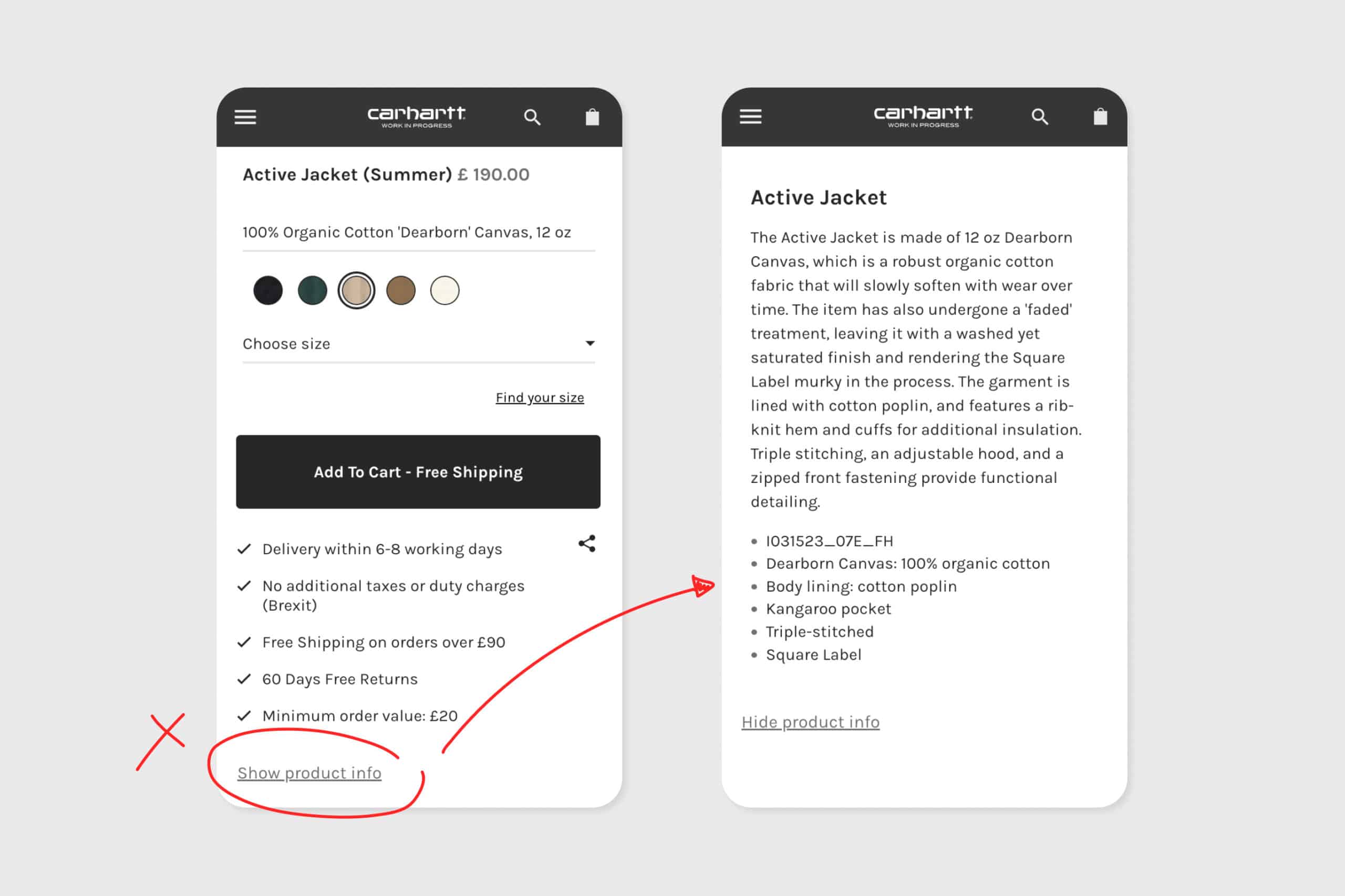 This additional step creates unnecessary friction, as users must spend extra time and energy to access essential information.
“Unveiling hidden product details adds unnecessary burden to the user journey”
Streamlining the user experience by displaying product information without requiring extra clicks is vital, as it allows users to allocate their energy to other crucial stages, such as the checkout process.
Another friction point is the lack of FAQs or Q&As.
These additional details are important for answering potential customer questions and further reinforcing the product's value proposition.
By revealing more comprehensive information, will reduce doubts or hesitations and get more clicks and taps on that all-important Add to Basket button.
Colour Variation Swatches Make it Really Easy to Decide on Which Version of the Product you want
Colour variation swatches on the page mean that users can quickly select their preferred colour option without relying solely on textual descriptions.
“Colour Variation Swatches allow users to effortlessly choose their preferred product version through visual queues”
This efficient visual queue accelerates the decision-making process and contributes to a smoother user experience.
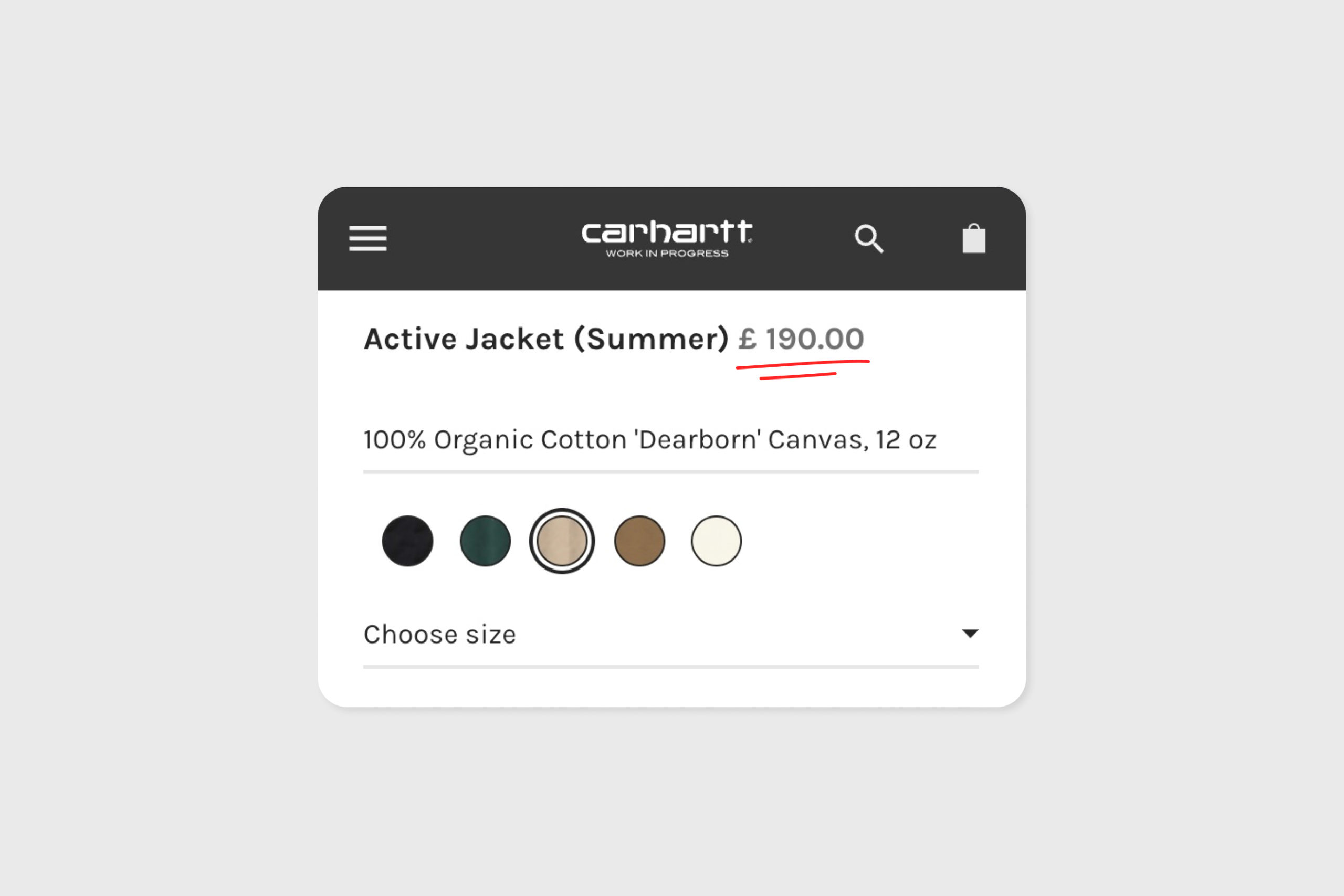 Pricing is a crucial factor in user decision-making. However, the Carhartt WIP product page falls short in highlighting pricing prominently.
The price is displayed in a lighter colour, making it less noticeable and potentially slowing down the decision-making process.
To improve the user experience, it is recommended to make pricing more visually prominent, ensuring users can quickly and easily identify the price associated with the product.
Effective communication of delivery options and associated costs is vital for e-commerce websites. Carhartt WIP partially addresses this by indicating free shipping through the "add to cart" button when the product meets the free delivery threshold.
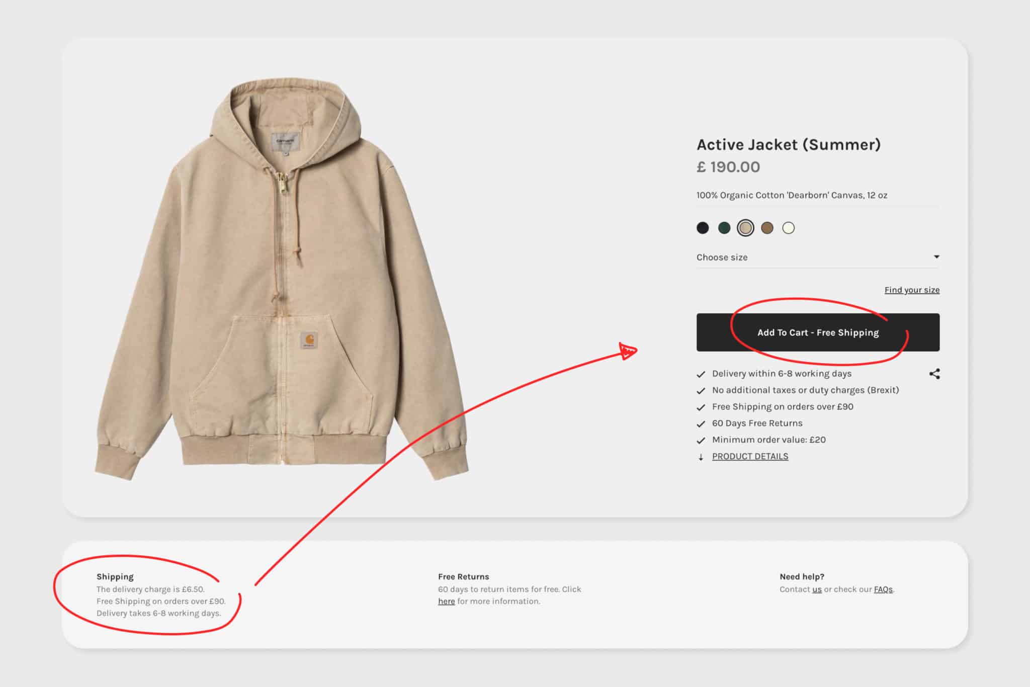 However, during our ecommerce UX audit, we identified an area for potential confusion as the delivery section further down the page contradicts the free shipping message by stating ‘The delivery charge is £6.50’.
This inconsistency may lead to uncertainty.
Additionally, the absence of a clear next-day delivery offer can discourage users who want their products quickly.
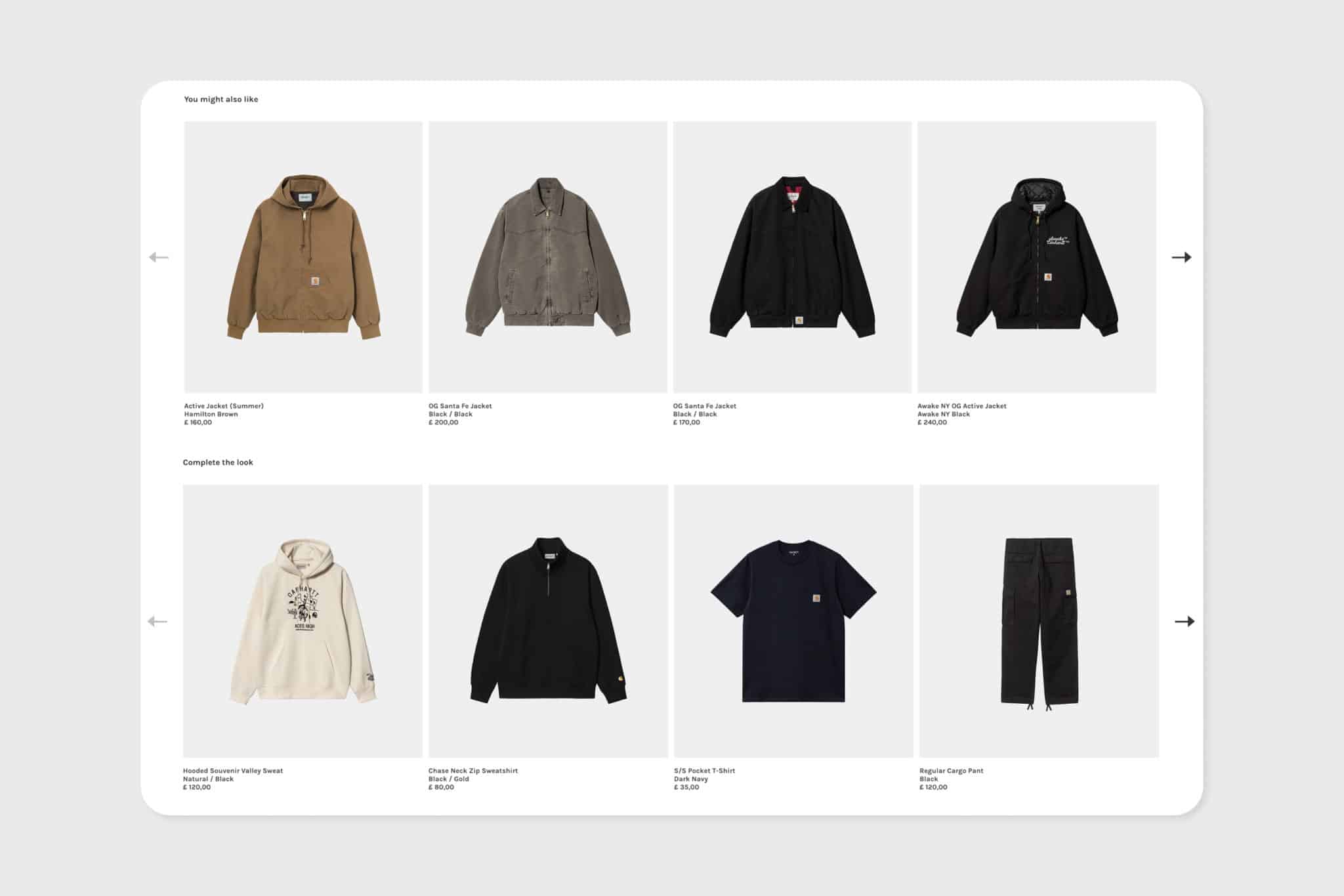 The "You Might Also Like" and "Complete the Look" sections are valuable features that inspire users to discover additional items they may want or haven't seen yet.
By presenting related products, Carhartt WIP prevents users from reaching a dead end and encourages further exploration within the site.
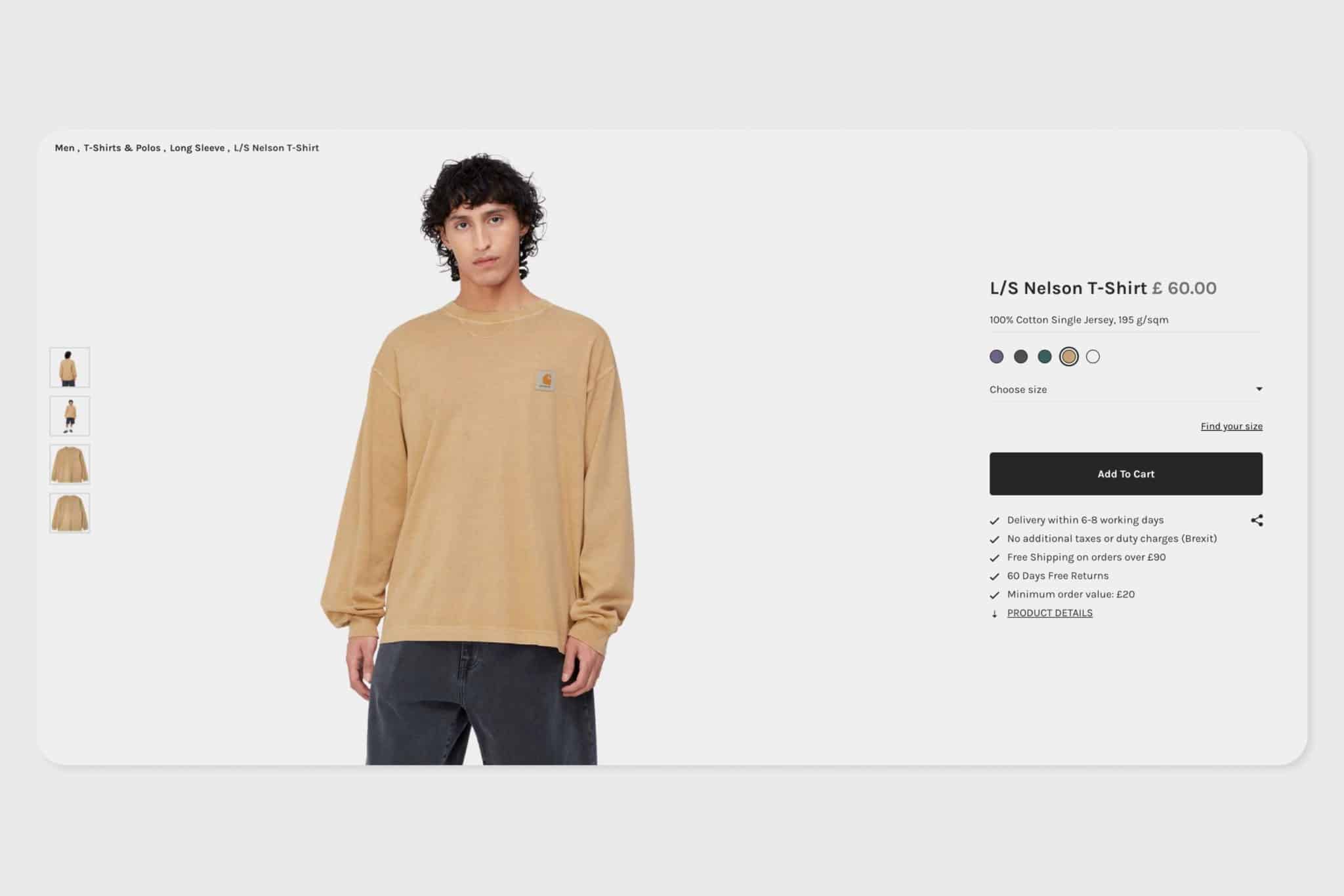 The page is pretty much distraction-free and the page scores 4 out of 5 for distraction.
There’s a minor issue with the share link near the "Add to Basket" button. If links and buttons are too close together, then users could accidentally click the share button instead of the intended action - clicking the ‘Add to Cart’ button
The content hierarchy on the page is really well-structured.
Important information such as the image gallery and product details are presented first and related products are positioned towards the bottom.
This approach helps users focus on the main product while still providing additional options.
Also Read: How to perform a UX Audit: A step-by-step guide UX
In this ecommerce UX audit, the product page receives a score of 2.6 out of 5, with value and friction as areas that require attention.
Here are the key takeaways:
Add more product image types to the imagery gallery
Work on improving the site speed and getting the page load time under 3 seconds
Consider adding reviews from customers to increase the trust and value of the site
Change the styling of the pricing so that it stands out more within the Buy Area
Increase the amount of product information by expanding the product description, adding FAQs and QAs
By implementing these recommendations, Carhartt WIP can enhance its product page and provide a more engaging and user-friendly experience for its customers.
Sign up for our newsletter.
Stay up to date with latest news, updates and general on-goings.