Take a look at our Grind Coffee website UX audit for some insights into their ecommerce product page. Find out what's good and what needs some improvement.
So, to get us started on our Grind Coffee UX audit, we focus on three key UX principles - value, friction, and distraction. Then we provide actionable insights that can help elevate the user experience for this website and potentially many others.
Here are the 3 key recommendations for Grind:
Value: Feature an image gallery with contextual images to provide users with an immersive product experience and showcase additional images.
Friction: Improve page speed to reduce load times, enhance user satisfaction, and minimize bounce rates.
Distraction: Grind prioritizes essential content placement, such as product imagery, descriptions, and pricing, which keeps users focused and minimizes distractions.
Watch the UX audit video and keep reading for more insights.
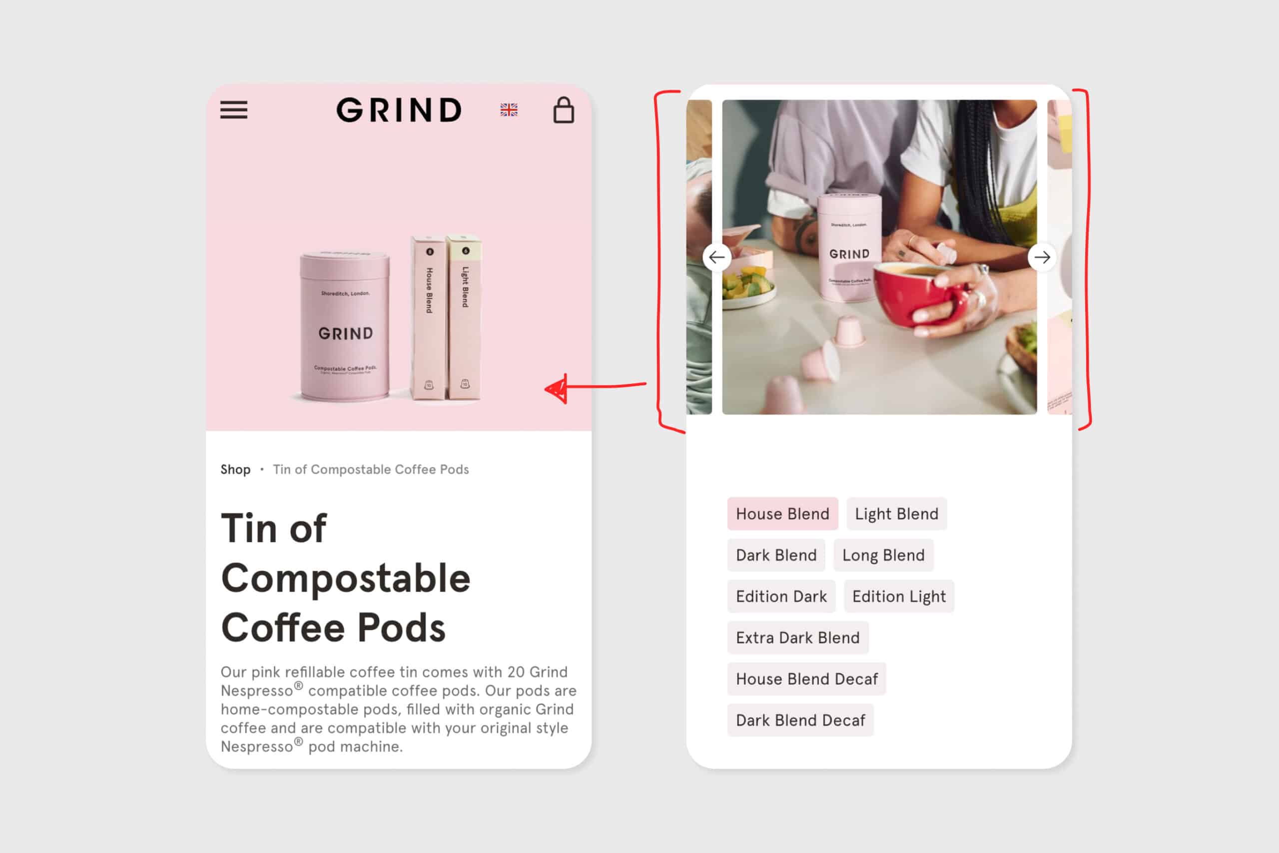
A visually appealing website is the first step towards creating a positive user experience. Grind.co.uk impresses with its simple and sophisticated design, accompanied by high-quality product images that leave a lasting impact on visitors.
However, with the absence of additional images, it’s really difficult to fully understand what you’ll get.
To enhance user engagement, it is crucial to feature an image gallery with image types such as:
Scale images
Lifestyle images
Textural images
By adding these, users get a complete idea of a product and don’t have to guess what it’s like. Furthermore, customer reviews are a valuable resource for building trust and encouraging conversions.
Placing reviews near the product title or image gallery can expose more users to this essential information, ultimately influencing their decision-making process.
Website speed is paramount to user satisfaction. Unfortunately, Grind suffers from slow load times, which can frustrate users and lead to high bounce rates.
Improving the page speed should be a top priority, aiming for load times under three seconds, ideally one to two seconds.
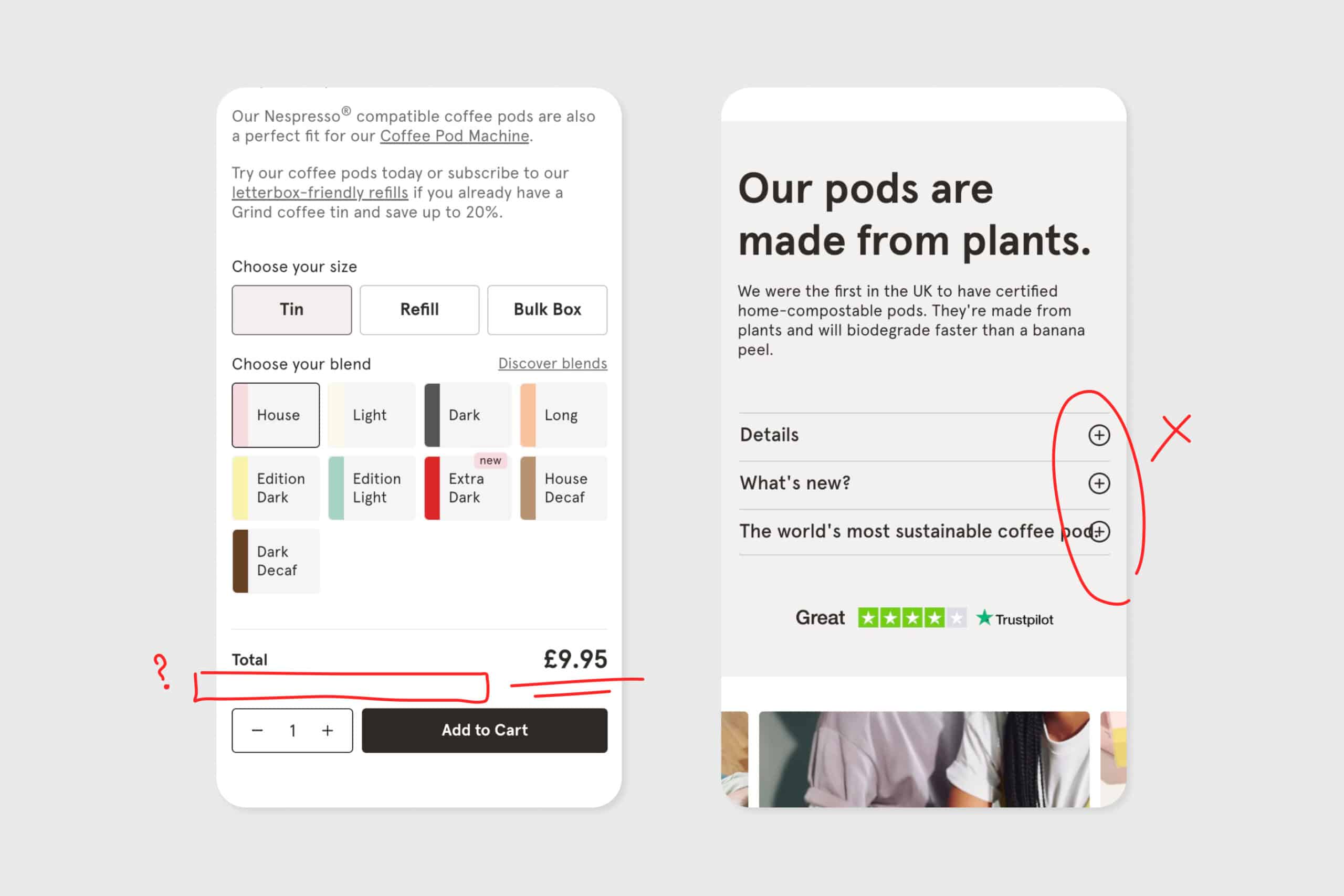
Pricing information features quite far down the page and there are no delivery details.
Users want to understand the total order cost (price and delivery cost) and they want to know when they’ll get it!
These elements play a vital role in the purchasing journey.
Presenting these crucial pieces of information above the "Add to Cart" button can streamline the process, reducing the need for users to scroll and potentially increasing conversion rates.
Keeping product descriptions concise, or offering a summarized version above the "Add to Cart" button, can also enhance the user experience, while still providing access to more detailed information further down the page.
Prioritizing content placement is key to reducing distractions.
Placing essential elements, such as product imagery, description, and pricing, at the forefront ensures users immediately find what they are seeking.
Summarizing the product description or utilizing bullet points makes the content more scannable, enhancing comprehension.
Furthermore, featuring alternative products as upsells can be beneficial, but careful placement is crucial.
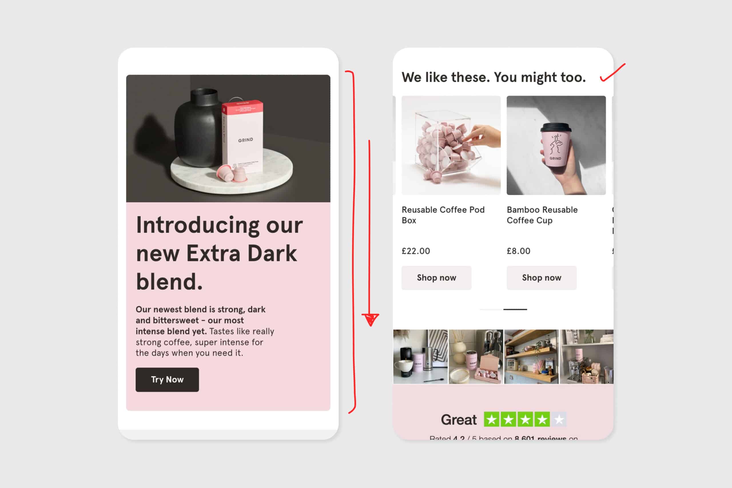
Moving the alternative products to the bottom of the page avoids distracting users from their primary focus while still providing options for exploration.
To sum up, a successful website is one that prioritizes user experience, offering seamless navigation, pertinent information, and contextual visuals.
Through our UX audit for grind.co.uk, we have identified critical areas for improvement.
By improving page speed, adding more images, and ensuring the user has all the pricing and delivery info they need, grind.co.uk will get top marks for UX.
Want more UX audits? You can check out our e-commerce UX audit of the Carhartt product pages here.
Sign up for our newsletter.
Stay up to date with latest news, updates and general on-goings.

