In 2021, the number of mobile users stood at 7.1 billion, with projections of it rising to almost 7.5 billion by 2025. Making design and development for mobile a priority. This is why we’re here to share the most important mobile UX best practices.
People are reliant on mobile devices for a multitude of tasks from communication to ecommerce, and on a wide range of screen sizes including smartphones, tablets, smartwatches, and laptops.
It isn’t enough to simply offer a mobile website. Mobile UX needs to go above and beyond, understanding user needs and behaviours, and how they differ from desktop devices.
Mobile UX faces the additional limitations of restricted screen sizes, which opens up an entirely new set of challenges.
Keep reading to find out our top UX best practices for mobile, across the home, search, PLP (product listing page) & filtering, PDP (product display page) and basket & checkout to improve the mobile ecommerce UX on your site.
Often, the homepage is the first place users will interact with on your site.
This is where they get an initial impression of what your company does, interact with the main navigation to explore your site and get an understanding of the product categories on offer.
Mobile users have limited interactions compared to desktop, so visual elements like auto-rotating are much harder to interact with.
Use an alternative solution to display information about your company, products and offers.
New visitors have a limited understanding of your product range, so you can make it easier for them to get a quick overview by including a range on the homepage, reducing the need to click through lots of different pages.
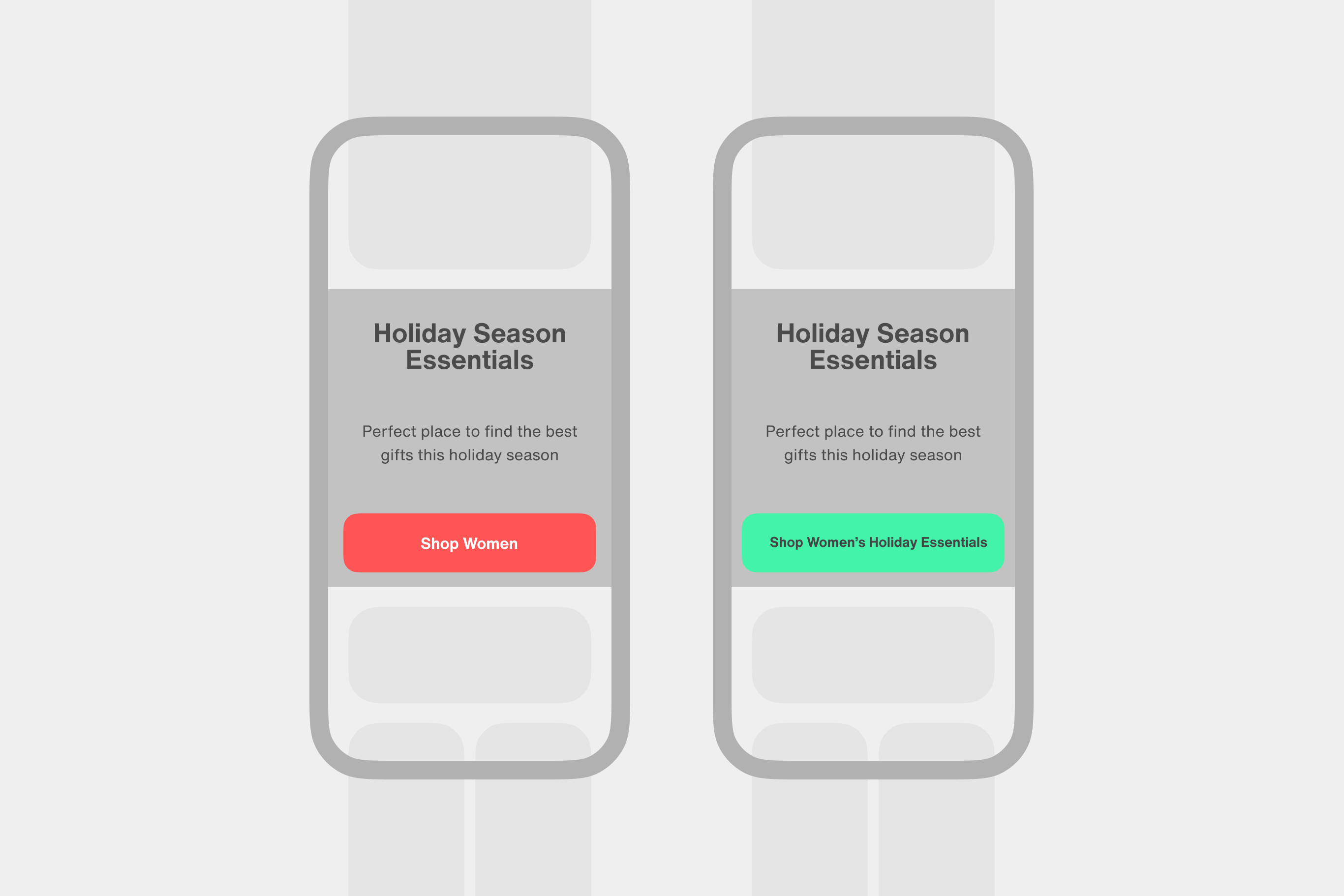 If you’re offering links to more specific categories, make sure you include the full name on the link or button to avoid confusing your users.
If you’re offering links to mens, womens and gifting categories within a seasonal category, make sure to clarify this on the button, for example ‘Shop Women’s Christmas Gifts’
Can you recreate something like this? Give me a shout if you need more context.
It can be harder to understand mobile navigation and hierarchy, due to the smaller screen size.
To help users navigate through your site, style menu items depending on their hierarchical importance.
To help users get to their destination faster, don’t hide product categories in a top level category as it increases the number of clicks required to get there.
Unlike desktop users who tend to spend more time browsing, mobile users are looking for specific information when they visit your site.
Whether they’re after a particular product or want to quickly find a category, if they can’t find it, they can’t buy it.
Your search needs to meet your users expectations and help them find the products they’re looking for with minimal difficulty.
Not all users will use the ‘enter’ button on their device native keyboard when using the search feature on your site.
Make sure you include a button that will perform the search when tapped to remove any friction for your users.
Avoid giving users no autocomplete options when they misspell a search term, to help keep them moving through your site. They can use the time they would have taken to correct their spelling, browsing the products you suggest to them.
Empty search results pages can cause a UX dead end, but you can quickly get users back on track by offering relevant links to popular product categories.
With the limited screen size of mobile devices, the product list layout needs careful consideration.
Product cards shouldn’t take up more than half of the viewport so users can get a clear overview of the product list, and separate product cards to avoid users mistakenly clicking on the wrong product.
When users navigate back from the PDP, take them to the same place in the PLP to minimise disruption to their browsing experience.
Additionally, to avoid overwhelming users when they load more products, use pagination or a ‘Load More’ button rather than an infinite scroll and avoid loading more than 15-30 products at a time.
How to display list items
On mobile devices, making maximum use of the space available is key.
Show the key features of the product on the product card
Maximise the visual information displayed
Add the price per unit where relevant
Allowing users to see which filters are applied will make it easier for them to condense the product list to the most relevant selection.
When offering number-based filters, letting users select their own values will offer a better UX as it gives them the most flexibility, rather than using predefined values.
PDPs often require a large amount of content, which, when paired with a small screen size leaves room for lots of UX issues.
The best way to condense the content on PDPs involves collapsing sections on the page so users can get an overview of the content of the page.
Include a minimum of 3-5 images, with at least one showing the product in scale to give a better sense of the product’s size.
To help make the product gallery more user-friendly, include image thumbnails, and ensure the full image gallery is visible within 1 viewport.
If you want to find out more about what to include in a successful product page, check out our 4 Essential Factors of Successful Ecommerce Product Page blog.
The final area we’ll look at is the cart and checkout area. This is often the most important part of the user journey; a seamless and intuitive experience will encourage users to complete their purchase, and return in the future.
Keep reading to find out how to make your mobile cart and checkout experience seamless.
Don’t get in the way of new users on their way to completing their transaction by requiring them to set up an account before they can proceed to checkout. Instead, offer guest checkout as the first option.
To reduce friction, make the password creation process as straightforward as possible; let users know all of the requirements, don’t ask for obscure passwords and let users view their password.
Checkouts are a collection of similar-looking input fields; if you want your users to understand what information you need from them, include microcopy to give context.
Most users don’t want to give more information than necessary, so clarify which fields are optional and which are required.
For unusual fields, offer additional context with tooltips.
Also Read: How to perform a UX Audit: A step-by-step guide
Mobile user experience is a crucial aspect of e-commerce design. The best practices discussed in this blog can help to improve the overall mobile user experience and increase conversions.
By implementing these techniques, you can create a mobile ecommerce experience that is both user-friendly and effective.
You should regularly review your mobile UX with different research tools and make updates to give the best possible experience to your users.
Good mobile UX can lead to increased customer satisfaction, loyalty, and ultimately, sales.
Sign up for our newsletter.
Stay up to date with latest news, updates and general on-goings.

